
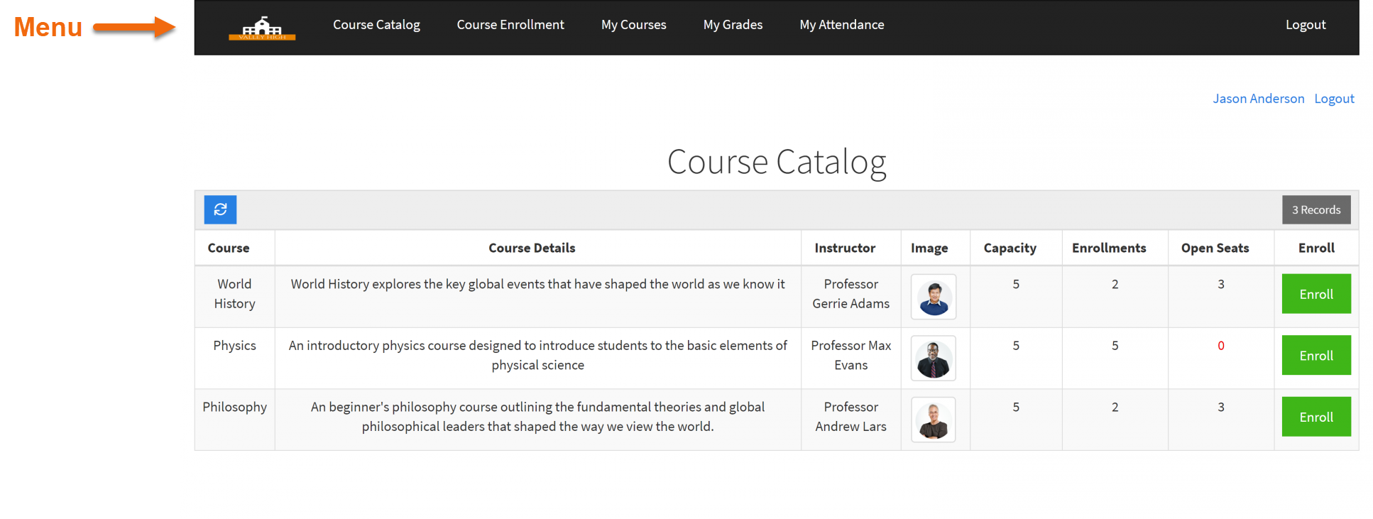
Menu
What is the Menu Component?
Adding menus

A new window will pop up prompting you to add items to your new menu by clicking on the +Add New Item button.
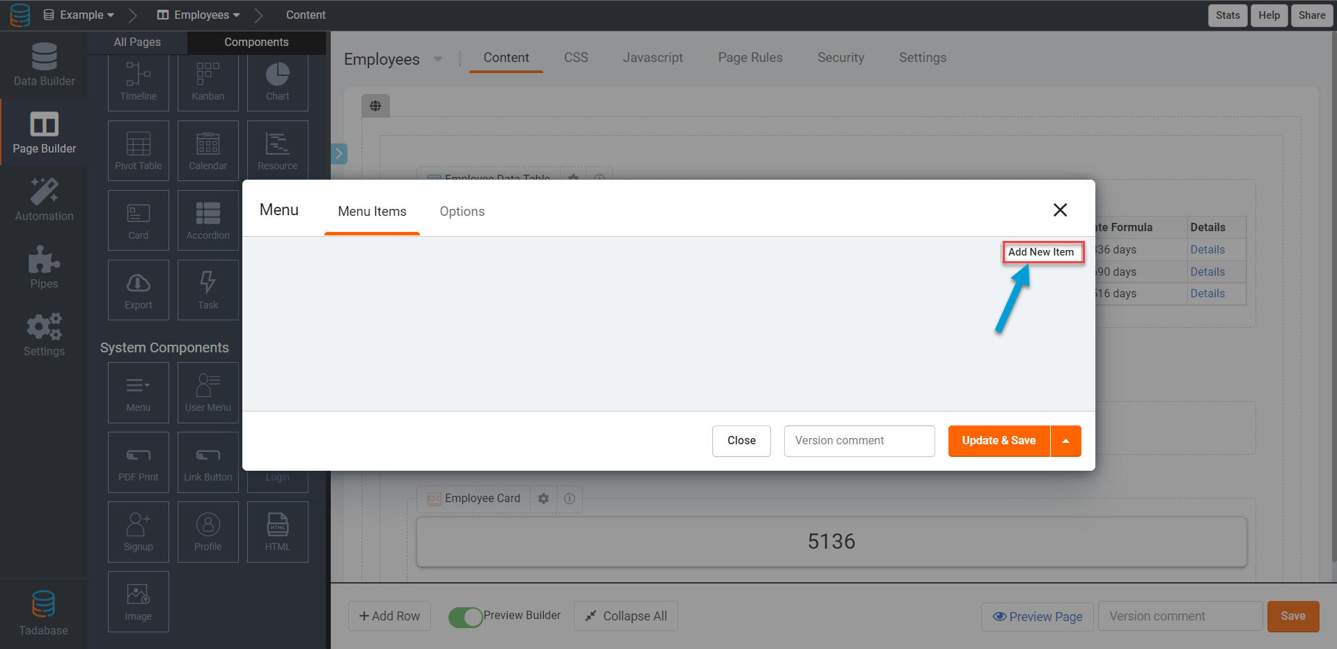
Enter the name of the item as you would like it to appear on your menu on the live app and select the item type.

Menu item types
There are five types of items that can be added to a menu:
Let's define each menu item type.
Page
Adding a Page item type to your menu refers to adding a link to any parent page in your app to your menu.
As a reminder, parent pages are pages at the top level of your app's list of layouts and pages, and aside for the three default pages that are built-in to each app (the login, sign up, and profile parent pages), parent pages are those that you manually create by adding a new page as opposed to child pages which are dynamically created via components (Details, Edit, and Add New child pages). When adding a page to your menu, you can not link to child pages, rather only to parent pages.
To add a page link to your menu, enter the name of the page link as you want it to appear on your menu on the live app, select "Page" as the item type, and select the parent page you want users to be routed to when clicking on this link within this menu.

As you can see in the image below, this menu now has a link to the Time Sheets parent page using the display name “Time Sheet Hours”. No matter how many additional items are added to this menu, when users click on the Time Sheet Hours link on this menu they will be routed to the Time Sheets page.

Link
Select the Link item type to add a website link to your menu. The link can be to any external website or to a page within your app.

As you can see in the GIF below, this menu now has a link to the tadabase.io website.

Custom
Select the custom item type to add any text to your menu. Text added to the menu as a text item type will not be a clickable link, rather the text can be used as a separator or placeholder text on your menu. For instance, you can add a text item to your menu to add a slogan following your logo on the menu.
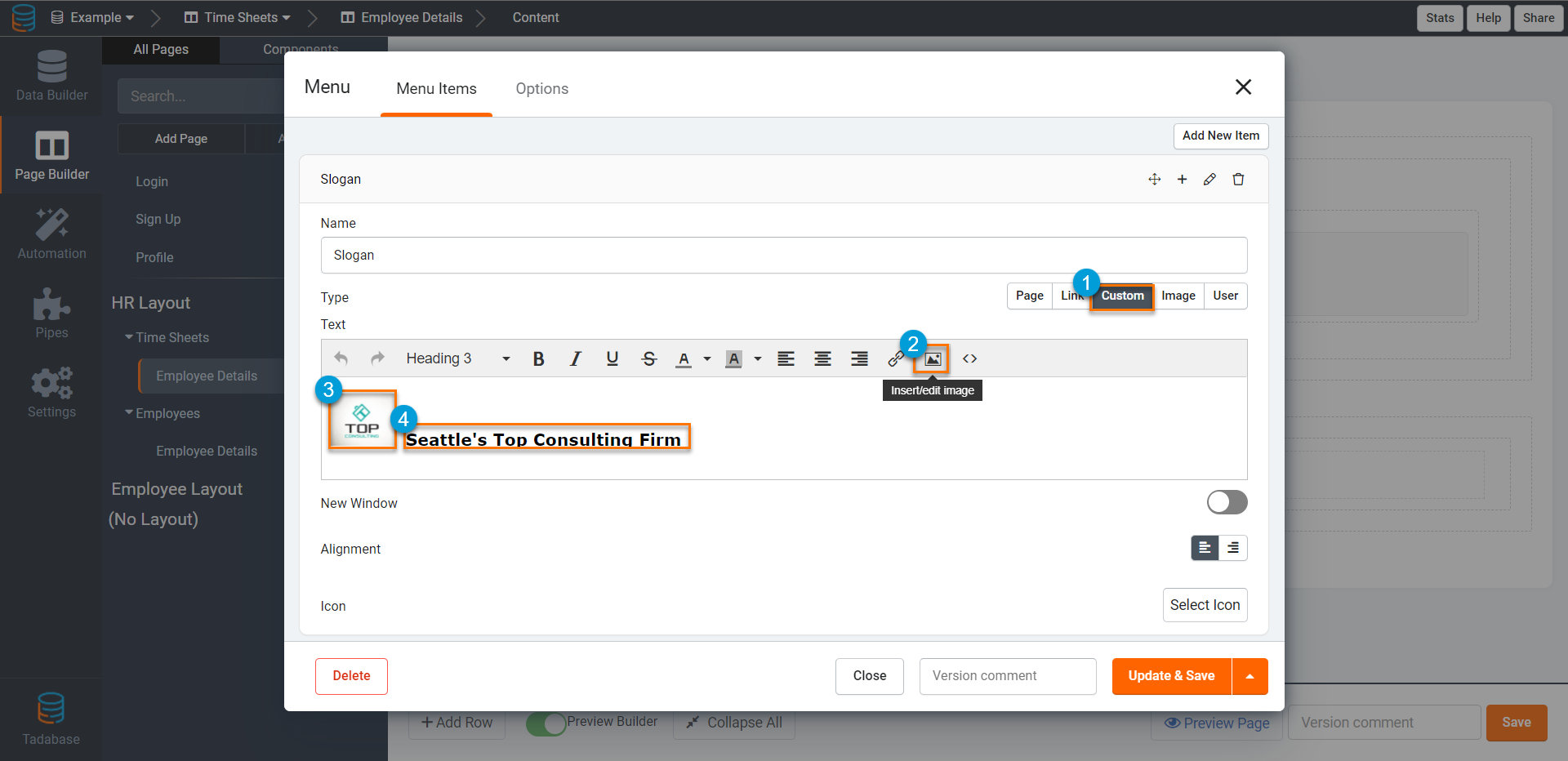
Once a logo image item is added to your menu as well, the menu can appear as such:

Image
Select the Image item type to add an image, such as a logo, to your menu.


You can choose to link a URL to the image, making it a clickable image that will route users to your desired website when clicked.

As you can see in the GIF below, the logo image on this menu links to the tadabase.io website when clicked.

User Links
Select the User Links item type to add a link to a user-related function, such as Login, Profile, Logout, and Sign Up, to your menu.

Adding User Links to your menu is functionally equivalent to adding a User Menu system component to your page/layout. Learn more about the User Menu to determine which method works best for your app needs.
There are four types of User Links you can add to your menu to route users to accomplish a specific user-related function:
- Login Link
- Sign Up Link
- Profile Link
- Logout Link
Let's define each type of Special Link you can add to your menu.
Login Link
Add a Login Link to your menu to route users to the default login page.
Adding a Login link to your menu is functionally equivalent to adding a page link to the default login page. However, the Login link is "special" because using this method results in the Login link disappearing from the menu when a user is logged in.
Sign Up Link
Add a Sign Up Link to your menu to route users to the default sign up page.
Adding a Sign Up link to your menu is functionally equivalent to adding a page link to the default sign up page. However, the Sign Up link is "special" because using this method results in the Sign Up link disappearing from the menu when a user is logged in.
Profile Link
Add a Profile Link to your menu to route users to the default profile page.
Adding a Profile link to your menu is functionally equivalent to adding a page link to the default profile page. However, the Profile link is "special" because using this method results in the Profile link disappearing from the menu when a user is logged out. In other words, when using a profile link as opposed to a page link to the default profile page, the profile link will only appear on the menu when a user is logged in.
Logout Link
Add a Logout Link to your menu to log users out of your app when clicked. When users click on the Logout link and logout, you can choose to custom-route specific users to a specific page based on their user roles.

New window
When adding items to a menu that are clickable links, you can choose whether the link should open as a pop-up. At default it opens the link in the current page. 
Menu item alignment

At default, the Alignment setting is set to Left.

Adding icons
You can add icons to each menu item to enhance the appearance of your menu:

Renaming Menus
Now, when adding a new page in the Page Builder, you can easily link that page to a particular menu by identifying the menu's name within the drop-down list of your app's menus.

You can link a page to a particular menu either when adding the page in the Page Builder and selecting the menu from the drop-down list of existing app menus, or by adding the page as an item to a particular menu as demonstrated above within this article.
Menu style
Within the Settings tab of a menu, you can change the menu style from horizontal to vertical.


By changing a menu's style to vertical, the menu would appear as such

Keep in mind, changing a menu's style to vertical will also change the structure of the layout, making the Page Container within the row of the menu. Please keep in mind that this may add some limitations in restricting the granular permissions over this row.

If you would like a full-length menu as seen bellow. This requires a bit of CSS code.

You can see in the GIF below that the menu changes from partial to full-length by using CSS.
You can go to your layout pages setting, click CSS, and copy and paste the code below.
Child Menu Items

As a result, your menu will include a child menu item as a drop-down option within its parent menu item. You can add multiple child items under a parent item.

You can add multiple levels of child menu items.
