
Accordion Component
What is the Accordion Component?
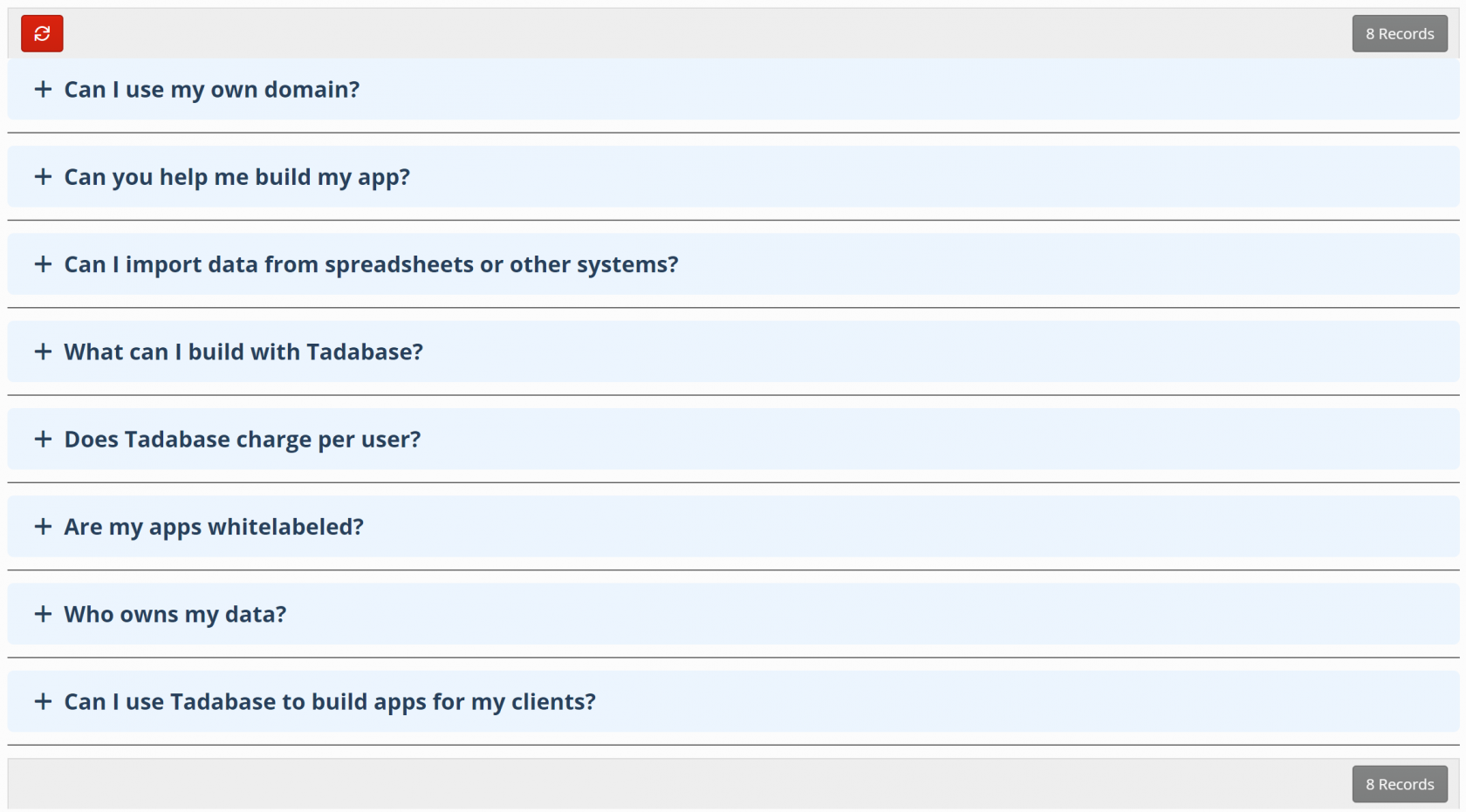
The accordion component enables you to expand and collapse data when the title of the record is clicked.

When should I use Accordions?
There are several use cases the most common and widely used is when showing questions and answers like FAQ's.
Adding Accordions
To add a Accordion choose the Accordion component and then choose the data table to be used for this Accordion.
Inside the Accordion component you'll see have some standard options available in other components, as well as unique settings only available in the Accordion component.
- Data Source
- Accordion Options
- Accordion Element
- Design
Data Source
The Data Source tab is where you can filter which records will be displayed in this component with some 'server-side' filtering. Since this is universal to all components you can view it as its own article here. Learn more about Data Source.
Accordion Options
Under the General option you'll have 2 options:
- Title
- Description

Title
Title to be used on top of the accordion component
Description
Description for your own reference.
Display Options
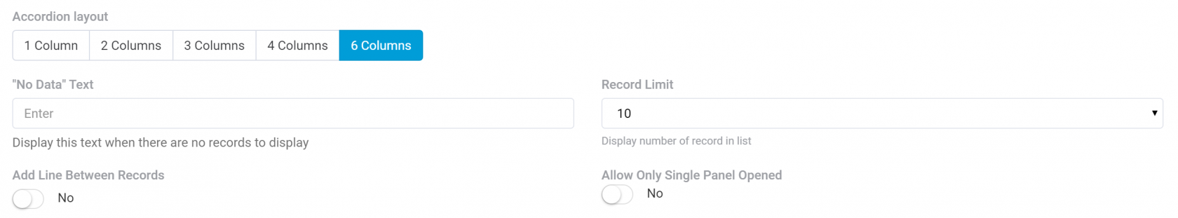
Accordion Layout
Here you can choose 1, 2, 3, 4 or 6 columns.

No Data Text
Choose what to display when no records are found.
Record Limit
Choose how many records should be displayed in the Accordion.
Add lines between records
Enabling this option will add a horizontal rule between each record.
Allow Only Single Panel Opened
When this is enabled, only a single record will be opened at a time. Any other opened panels will be collapsed.

Enable Inline Edition
Enable this option to allow records to be edited.
Only the body of the accordion can be edited via inline editing, the title can't.
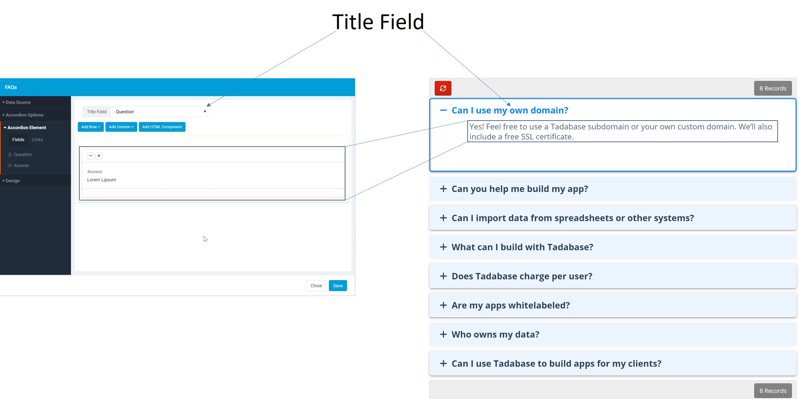
Accordion Element
In the accordion Element you choose the title field that should be used int he accordion as well as which fields should be visible in the body of the component.
Design
In the design tab choose many any custom design options.
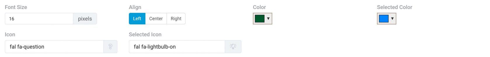
Title Settings
- Font Size
- Align
- Color
- Selected Color
- Icon
- Selected Icon
Content Settings
- Color
- Font Size
- Align
- Padding

Content Settings
- Color
- Size
- Alignment
- Padding

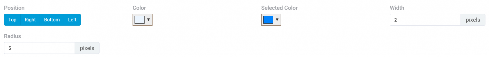
Border Settings
- Position
- Color
- Selected Color
- Width
- Radius
Position
Element Settings
- Background Color
- Selected Background Color
- Margins

Shadow Settings
- Depth
- Selected Depth

Diagram overview:
