
Image
What is Image Component?
Image components are components that you may upload an image to display on your page or layout. This component contains various options to configure your image to appear as needed on your pages.
All static images -images not added into a data table can be reused by clicking on My Images.
Images have several settings:
- Caption
- Alternative Text
- Alignment
- Size
- Modal Popup
- Responsive
- Title
- CSS
- Link
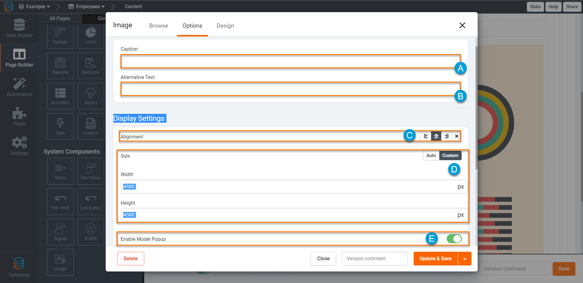
Caption
This will add a caption below the image.
Alternative Text
When browsers are disabled from showing images, or image fails to otherwise load, this text will be displayed. This can also be helpful for Search Engine Optimization.
Alignment
Choose how to align your image.
Size
By default the image will remain the same size as the image uploaded, you can choose to set a custom size here.
- Setting only the width or the height will increase the size and keep the aspect ratio even if one value is blank.
- Setting both values will set the picture to this exact dimensions.
Responsive
Responsive images will attempt to follow the size specified above but will adapt to the screen size as well.
For example:
- If an image is inside a column which is 250 pixels wide and the image is set to be 300px - the image will be scaled down to 250px.
- If an image is inside a column which is 250 pixels wide and the image is set to be 100px - the image will be scaled down to 100px and keep the aspect ratio.
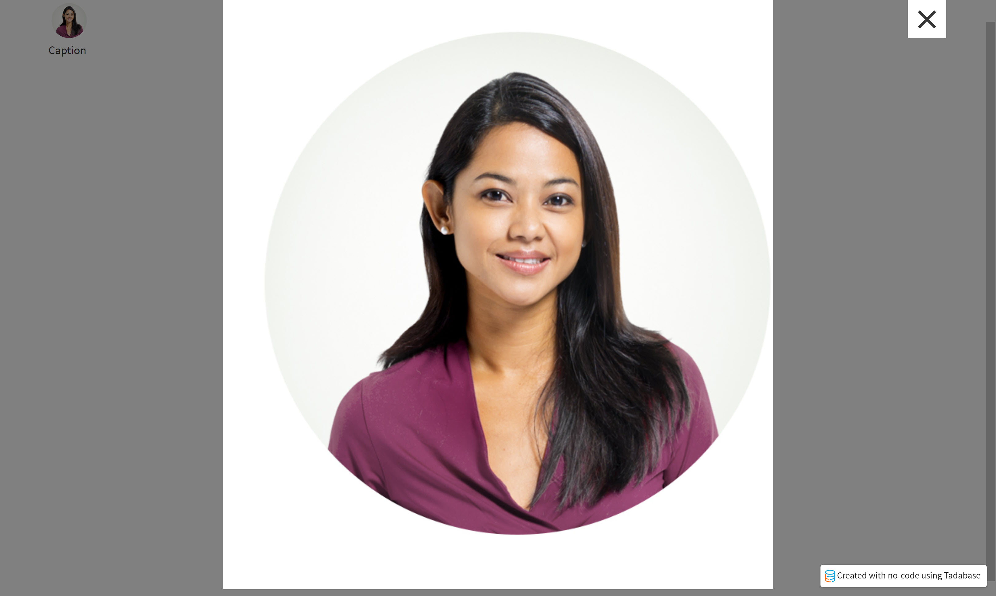
Popup Modal
When enabled this will open the picture in a large pop up window when pressed.
Link
To make the image a link to route users to external sites, enable this option.

Enabling Link and Popup will create a conflict and the link will direct users to the link location.

You can also customize the Design of your Image Component. Adding special customizations to text, background, border, spacing, and CSS. See here for more details on each tab.