List Component
What is the list component?
The List Component is a data component that you can add to pages within your app for users to track, update, and automate your data in a highly customized list or gallery view.
List layouts
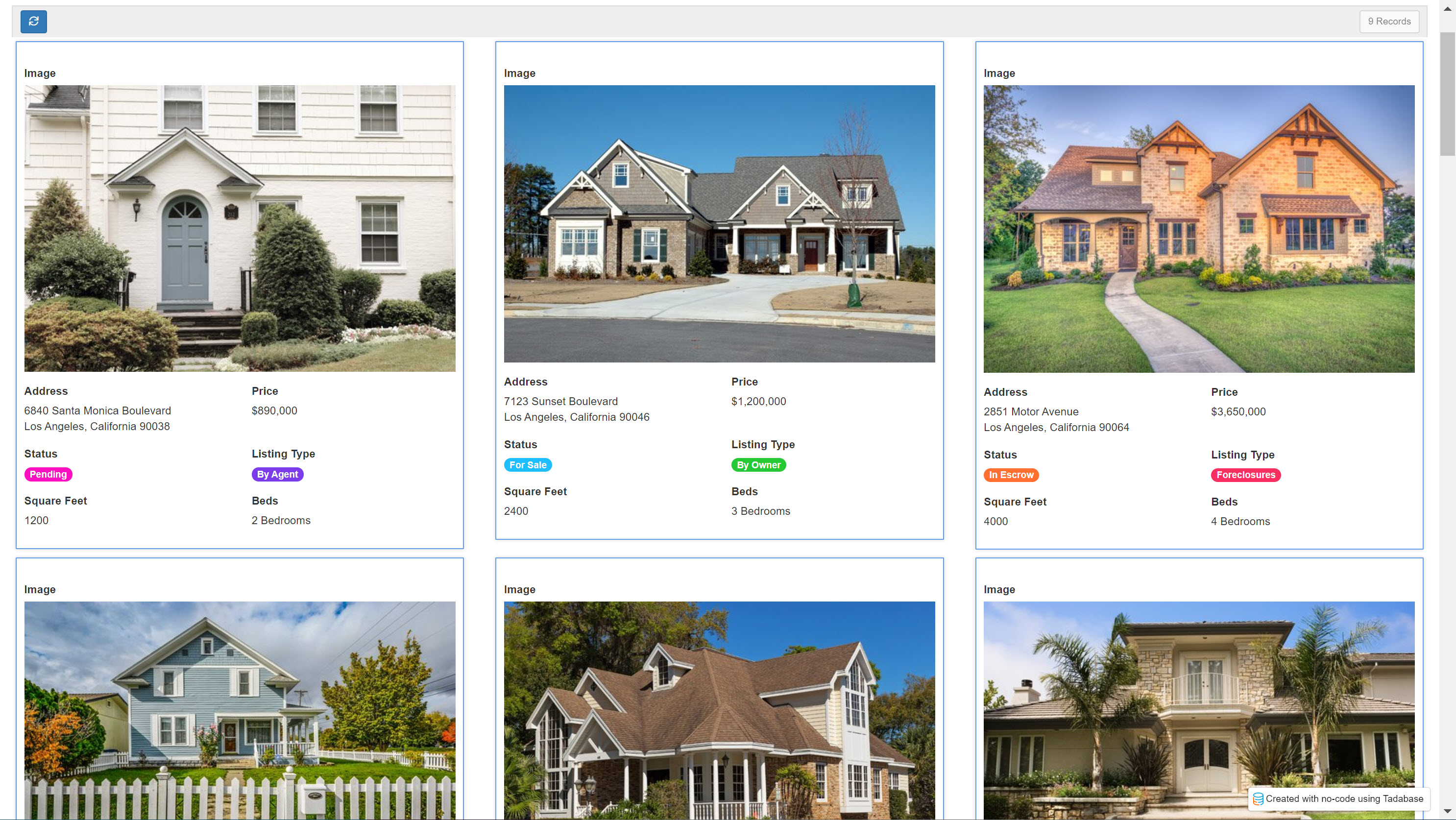
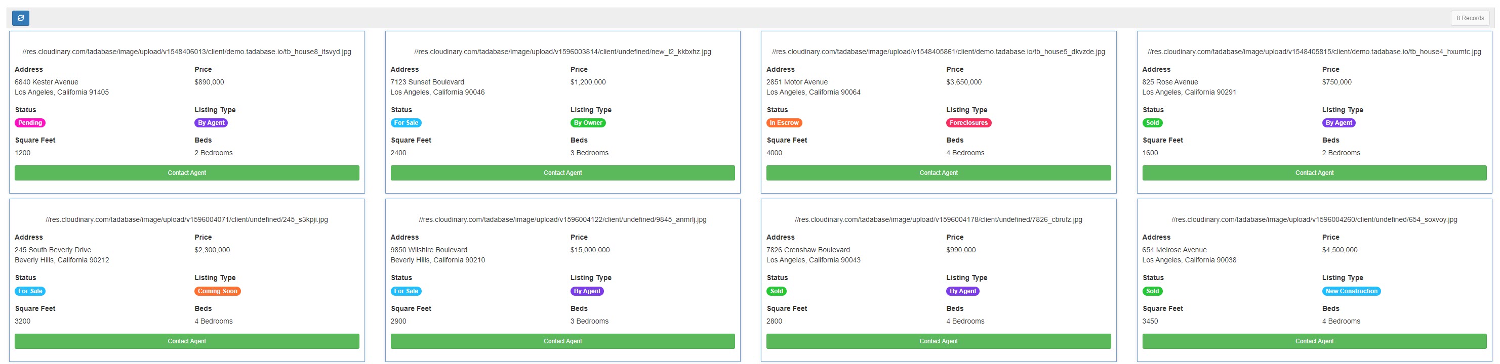
Similarly to table components, list components display records from a selected data table using selected fields from that data table and connected data tables. However, whereas table components display records similarly to spreadsheets- with fields as header columns as records as vertical rows- list components display records with each record displayed within its own column/card and the selected fields duplicated for each record within each record's column/card.


Adding list components
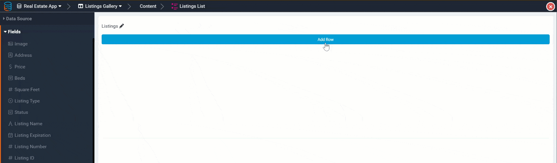
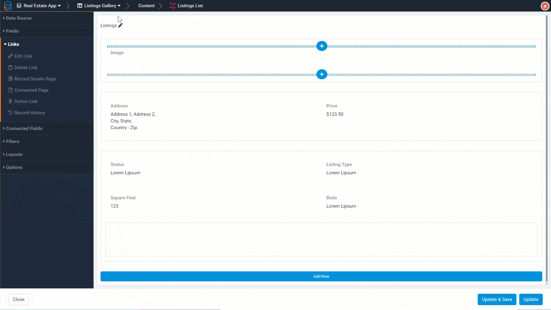
Like all other data components, list components can be added to a page within your app, specifically within a column on the page.
To add a list component to a page, go to the Page Builder and select the page onto which you wish to add the list component. Within that page's Content tab, click on the blue + icon within the column you wish to add the list and select the list component from the drop-down list of components.

Once you click on the list component to add it to the page, you will be prompted to select the data table from which you want this list to display records.


As a reminder, columns are added within rows and fields are added within columns.


Adding connected fields
In addition to adding fields to list components, you can also add connected fields.
Connected fields are fields from a data table that is connected to the current list component's data table. You can add Connected Fields to a list component to enable users to view those connected values within the list.
Connected fields are read-only, and while their values will be dynamically updated within a list component, they can not be directly updated or edited by users within the list component.
For instance, say you have a Real Estate app with two data tables:
- Listings data table
- Buyer Applications data table with a connection to the Listings data table (each application belongs to a listing)
Now, say that within the Buyer Applications list component you want to view the connected listing for each buyer application. You can do this by adding connected fields from the Listings data table to the Buyer Applications list component, such as the listing address field and the listing image field. Add these listing fields to the Buyer Applications list component by selecting them from the Connected Fields tab located on the left-side menu of the list component.

Now, the Buyer Applications list component will display the listing address and image connected fields.

These connected fields are for viewing purposes only in the Buyer Applications list component, and while their values can be dynamically updated when other field values are updated, users will not be able to directly update these connected field values within this list.
Adding links
Customizing list fields
Whether you add fields, connected fields, or links to a list component, you can customize each item within the list either by double-clicking on it or by hovering over it and clicking on its pencil icon within the list component.
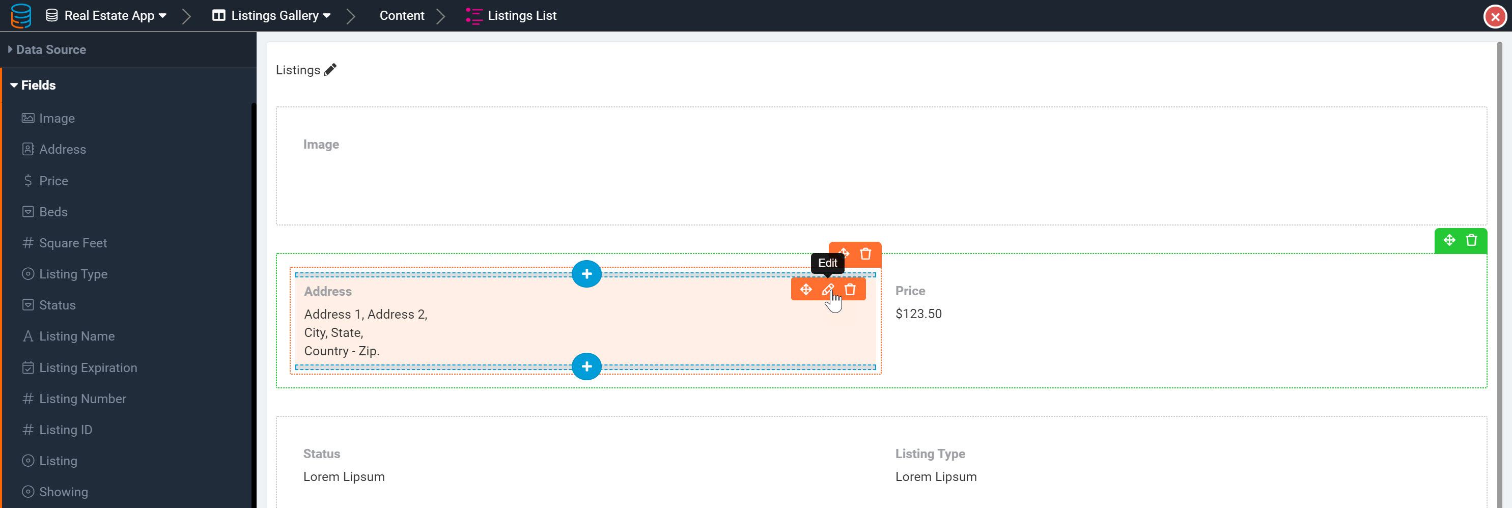
When you open a field or link to edit it, you will be directed to its edit page where you can customize the field/link using three tabs- a General tab, a Format Tab, and a Display Rule tab.

When adding Action Links to a list component, action links come with a fourth tab- the Action Rule tab- where you can customize each action link's action rule(s).

As we discuss Action Links extensively within the Links article, please click here to learn more about action links and adding them to components.
General field settings
Within the General tab of a field/link's edit page, you can customize several general settings which we will discuss below.
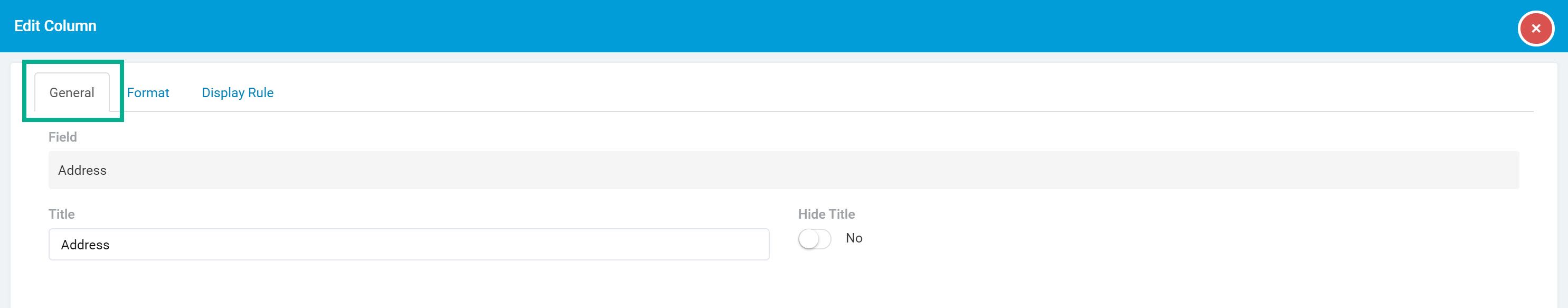
Let's first discuss the basic settings within the General tab, after which we will discuss the unique general customization settings that are dynamically available for specific field types.
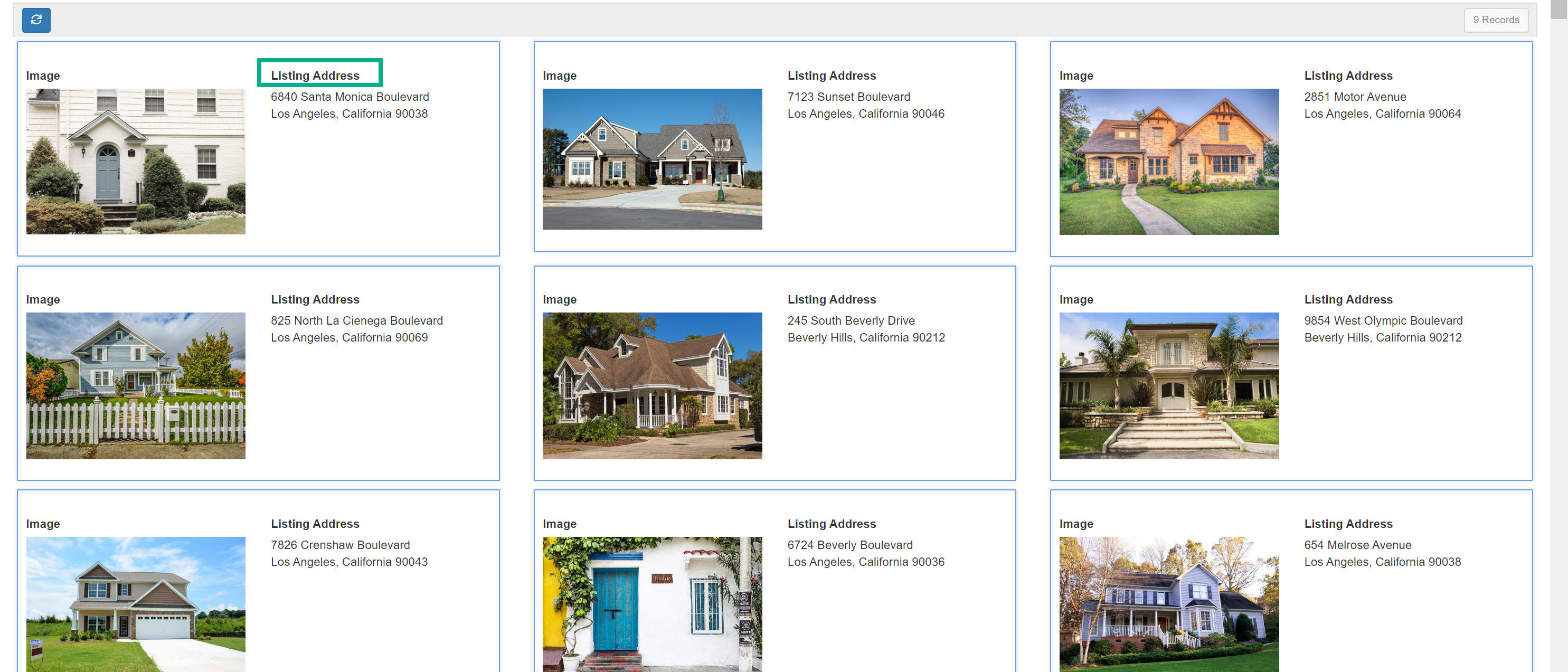
Field title
By default, field/link titles display above each field/link within the list component.
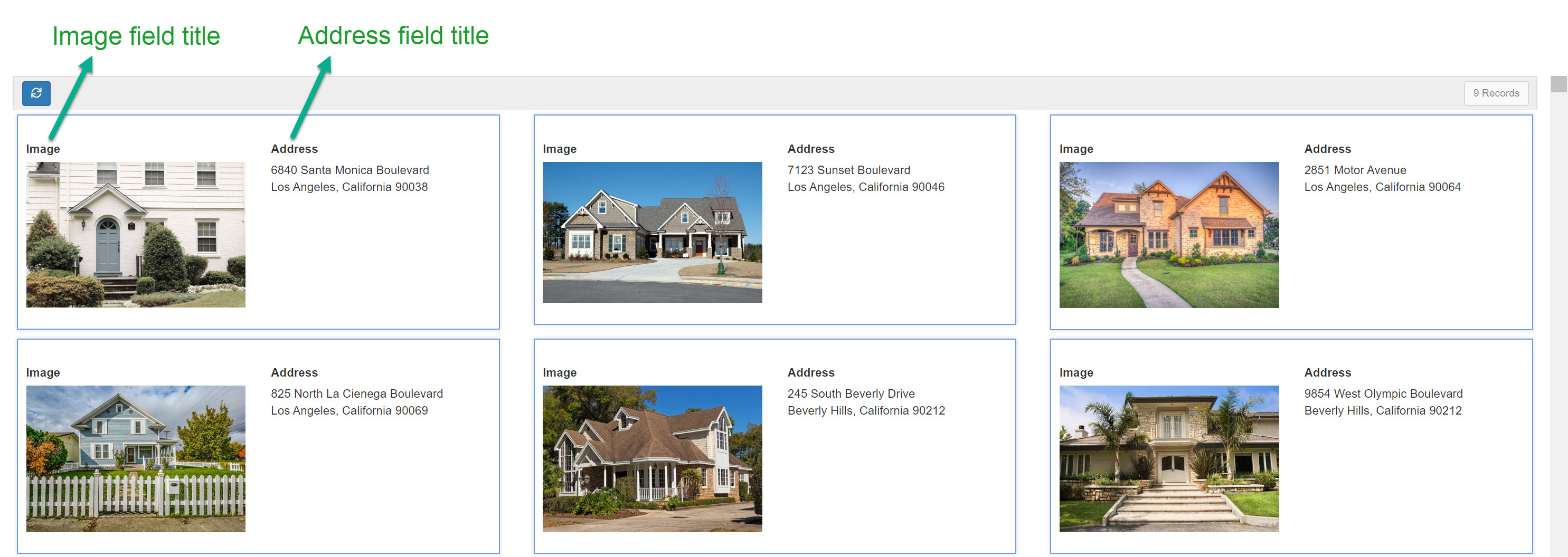
By default, when you add a field or link to a list component, the field/link title will display with its original field/link name. For instance, if you add an Address field to the list component, the field title accompanying the Address field will display as "Address".

If you wish to change the field title, simply enter a new field title within the Title setting. For instance, you can change the "Address" field title to "Listing Address".

Now, the Address field will display "Listing Address" as its field title for each record within the list component.
Hide field title
You can also choose to hide the field/link title from the list component.
For instance, you can choose to hide the Image field title by toggling the Hide Title setting from No (default) to Yes.

Now, the image field's title will be hidden from the list component for each record.

The above-mentioned general customization settings located within the General tab of a field's edit page are universal to all field and link columns added to a list component. There are, however, some general customization settings that are unique to certain fields and links that will only appear as options within the Edit pages > General tab of those specific field and link columns.
Let's explore these unique general customization settings below.
Image field settings
Within a list component, image fields have unique customization settings within the General tab of their Edit pages. Let's discuss these unique settings specific to image fields in a list component.
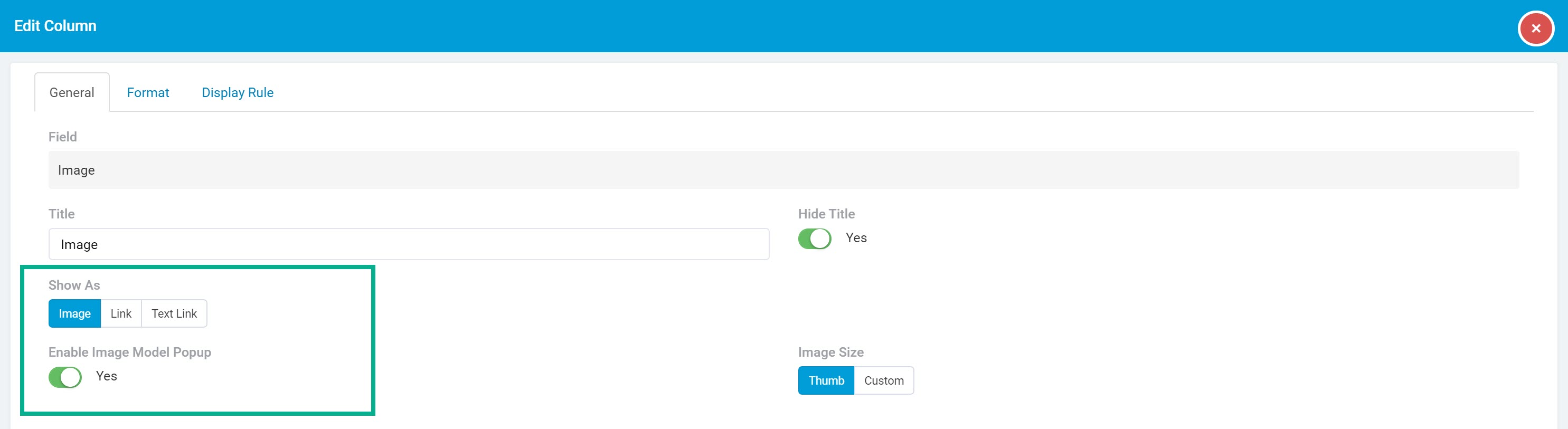
Show as
Within the Edit page > General tab > Show As setting of an image field within a list component, you can choose whether to display the images in this field as an image, link, or text link.

Selecting image will display this field's image values as images for each record card.

Selecting link will display this field's image values as links for each record card.
Selecting text link will display this field's image values as a link with custom text, such as "View Image":

When you select the text link option, an option will dynamically appear for you to enter the text you wish to display within the link.

Enable image modal popup
When you choose to show the images as an image, you will also have to option to choose whether you would like the images to popup within a new modal window when clicked.
If you set the Enable Image Modal Popup setting to Yes, this image field's image values will popup in a modal window when clicked.

Image size
When you choose to show the images as an image, you will also have to option to choose whether you would like to display the images as a thumb size (default) or as a custom size.

By default, images within an image field column will display at the default thumb size which is 50px x 50px (pixels).
You can override this default image size by selecting the custom size option and setting your custom pixel size.

Rating field settings
Within a list component, rating fields have a unique customization setting within the General tab of their Edit pages. Let's discuss this unique setting specific to rating fields in a list component.
Rating output
Choose if you would like to display the rating via its relative icon value or via a number value.

If you select an icon output, the rating will be displayed with the specific icon and icon color you selected when you originally created this rating field within the Data Builder.
If you select a number output, the rating will be displayed as a number value.

Click here to learn more about creating rating fields and defining their icon values within the Data Builder.
Slider field settings
Within a list component, slider fields have a unique customization setting within the General tab of their Edit pages. Let's discuss this unique setting specific to slider fields in a list component.
Slider output
Choose if you would like to display the slider value as a number or as a progress bar.
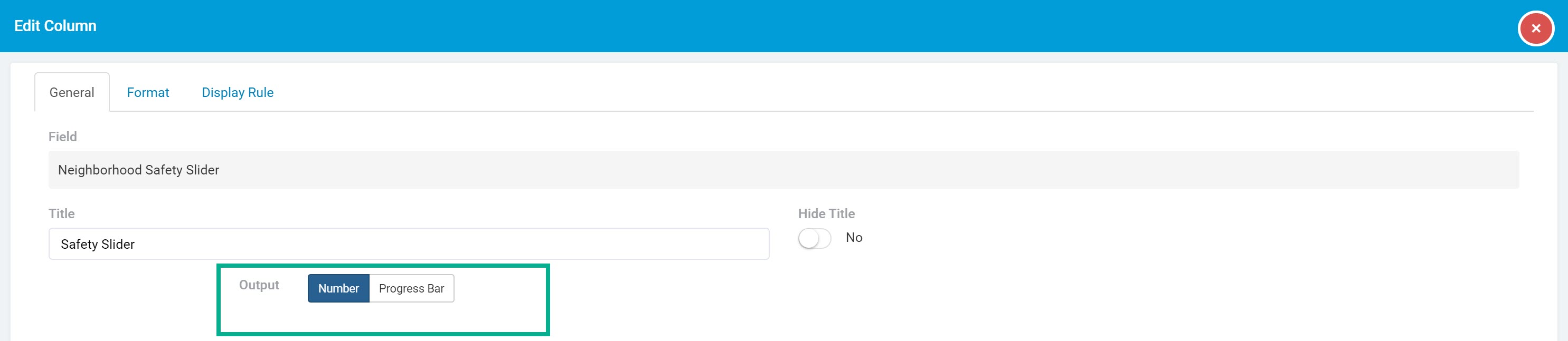
If you select the number option, the values within this slider field will display as a basic number value for each record.
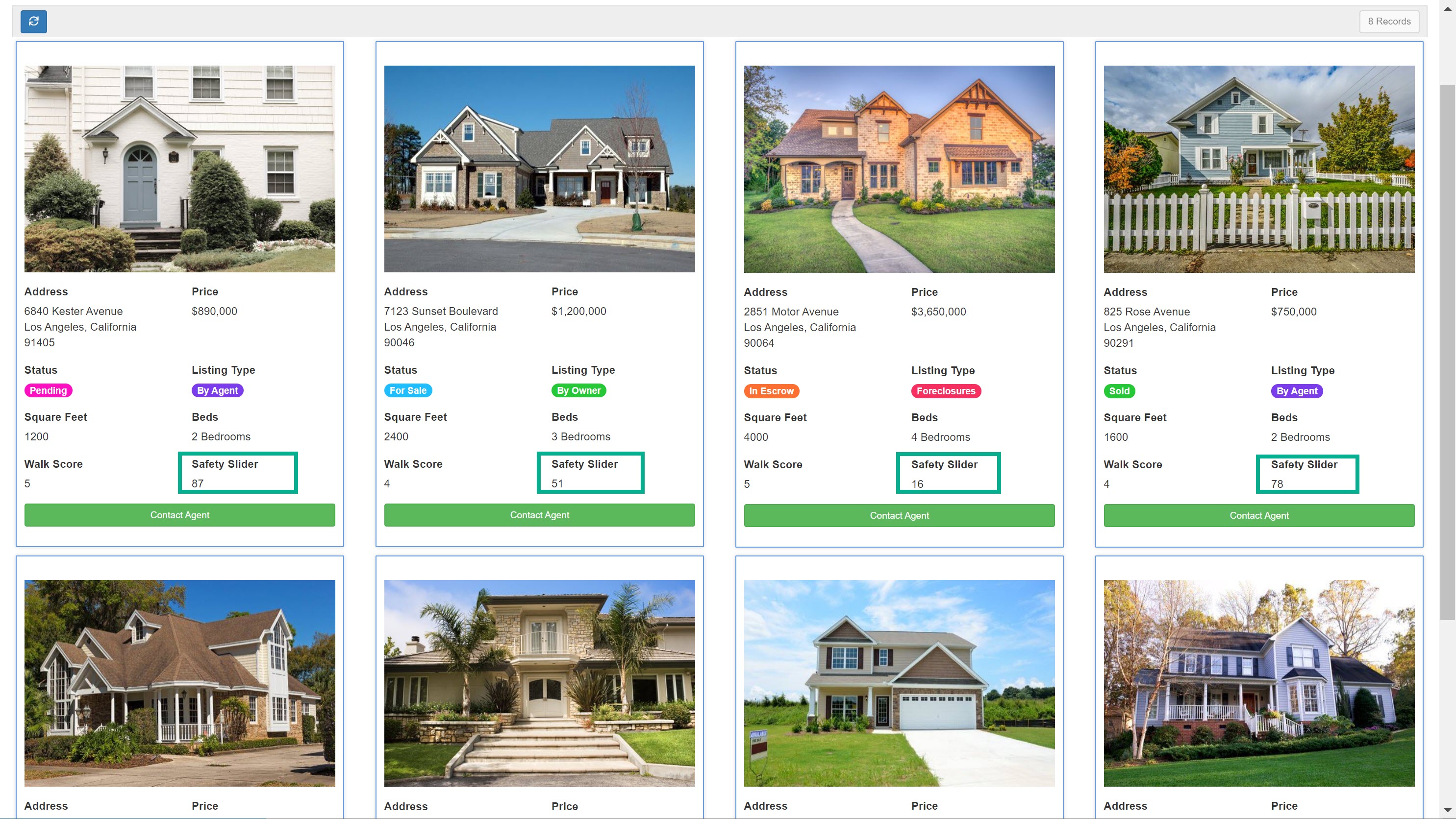
If you select the progress bar option, you will then be able to customize how the progress bar should display, including if the progress bar should display as a solid bar or as a striped bar, the default color of the progress bar, and optional color rules to display the progress bar with custom colors based on certain values. For instance, you can set the Neighborhood Safety Slider bar field to display with a blue bar at default, a green bar when the safety score is above 75, and a red bar when the safety score is below 25.
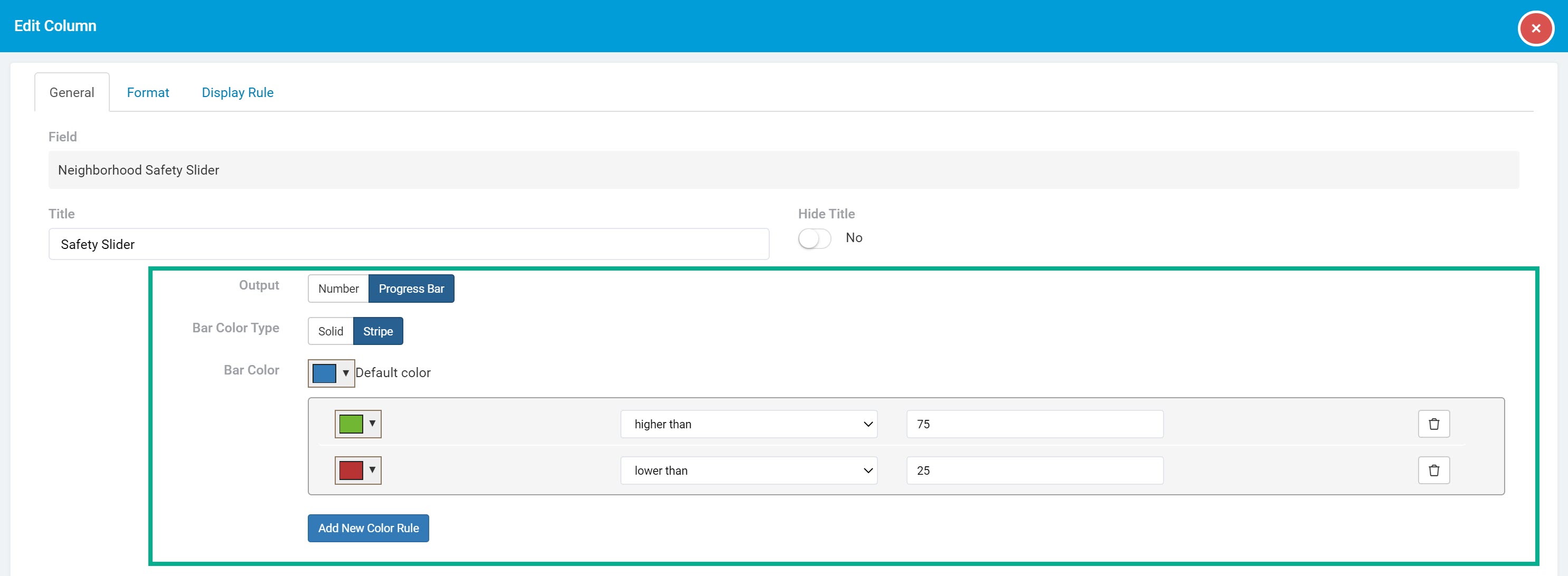
Now, this slider bar field will display with the above settings for each record within the list component.

Connection field settings
Within a list component, connection fields have unique customization settings within the General tab of their Edit pages. Let's discuss these unique settings specific to connection fields in a list component.
Set value link
When using a connection field within a list component, you can choose whether to display the connection field values as links to child pages connected to that connection field.
For instance, within a Buyer Applications list component, you can add a Listing connection field to display the connected listing that each buyer application belongs to.
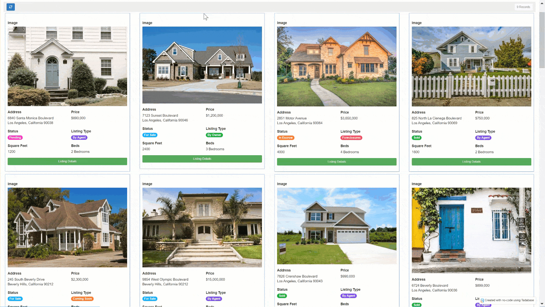
Within the Edit page > General Tab > Value Link setting of the Listing connection field , you can choose to change the display of the listing field values for each buyer from "No Link" (default) to a link to a connected child page, such as the Listing Details Page.
Now, each buyer application's connected listing will be displayed as a link that, when clicked, will direct users to the details page of that buyer application's listing.
Value separator
If the connection field that is added to the list component has a connection of one-to-many, you can choose if each connected value should be separated via commas or displayed each on a new line.

HTML field settings
Format column settings
The second tab of each field's Edit page, the Format tab, is where you can customize the format settings for each field or link within the list component.

Let's first discuss the basic formatting settings within the Format tab, after which we will discuss the unique formatting settings that are dynamically available for specific field types.
Field alignment
Choose a left (default), center, or right alignment for each column.
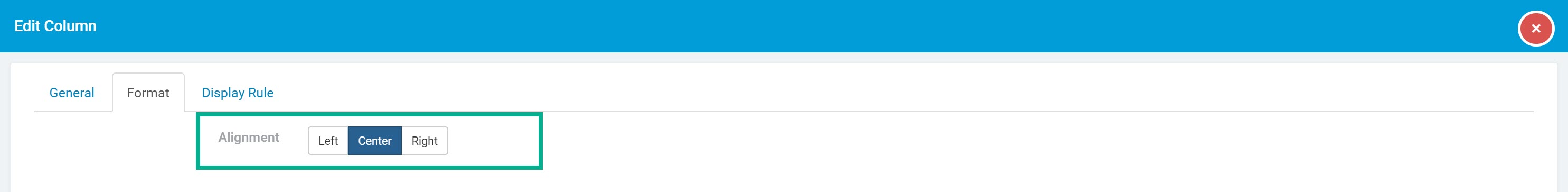
For instance, if you center the alignment for each field within a table component, all field values will be centered as such:

Now that we have discussed the format settings that are universal to all fields within a list component, let's discuss the unique format settings that are dynamically available only for specific field types within the Format tab.
Email field settings
Within a list component, email fields have a unique customization setting within the Format tab of their Edit pages. Let's discuss this unique format setting specific to email fields in a list component.
Email display format
Choose to display email values as a link or as plain text.

For instance, if you select Link, email values will display as a clickable link.

Address field settings
Within a list component, address fields have a unique customization setting within the Format tab of their Edit pages. Let's discuss this unique format setting specific to address fields in a list component.
Link to Google Maps
Choose if address values should display as a link that, when clicked, will direct users to Google Maps.
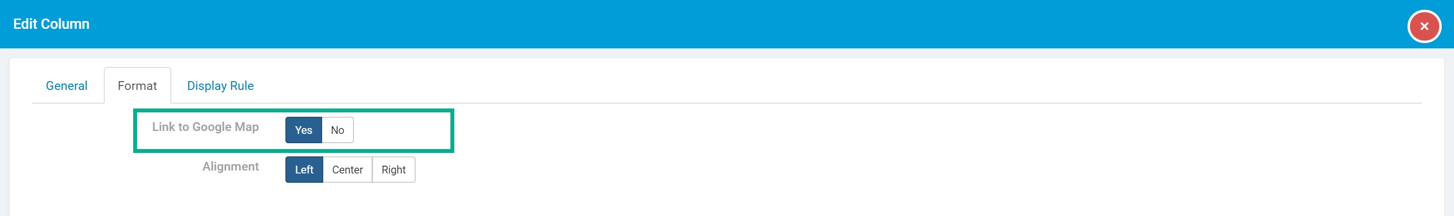
If "Yes" is selected, address values will display as a link that, when clicked, will open the address within Google Maps in a new browser window.

Date field settings
Within a list component, date fields have unique customization settings within the Format tab of their Edit pages. Let's discuss these unique format settings specific to date fields in a list component.
Date format
While you can set your app's overall date formatting settings within the Settings tab of your app's main navigation menu, you can choose to override the app-wide date format settings and set a custom date format for specific date fields and date/time fields within a list component.
If you wish to set a custom date format for a specific date field or date/time field within a list component, select your desired date format within the Edit page > Format tab > Date Format setting.

Time Format
While you can set your app's overall time formatting settings within the Settings tab of your app's main navigation menu, you can choose to override the app-wide time format settings and set a custom time format for a specific date/time field in the list component by going to that field's Edit page > Format tab > Time Format setting.

Date Output Format
By default, date fields and date/time fields are displayed as basic dates and times. However, you can choose to display date and date/time field columns as age values or as stopwatch values rather than as basic dates and times.

For instance, if you have a Listings list component with a Listing Expiration date/time field, you can select an Output Format setting of Stopwatch to display the date/time values within this specific field as a stopwatch/countdown.

Or, within the On Market Since date/time field, you can select an Output Format setting of Age to display the date/time values within this specific field as an age.
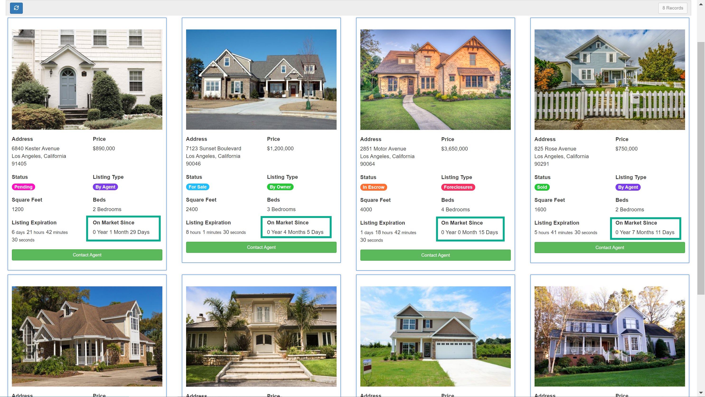
Alternatively, if you were to select an Output Format setting of Date for these two columns, both column values would be displayed as regular date/time values.

When selecting an Output Format of Age, you can also customize whether to include the month and/or days within the age output.

The image below displays the difference between a basic date value, its display as an age, its display as an age with included months, and its display as an age with included months and days.

Option field settings
Within a list component, option fields have a unique customization setting within the Format tab of their Edit pages. Let's discuss this unique format setting specific to option fields in a list component.
Option format
If you have an option column that can have multiple options selected, you can choose to display each selected option by separating each option on a new line or by separating each option inline with commas.

For instance, if you choose to separate multiple Listing Type options via new lines, each selected listing type will appear on a new line.

Image field settings
Within a list component, image fields have a unique customization setting within the Format tab of their Edit pages. Let's discuss this unique format setting specific to image fields in a list component.
Responsiveness
You can set an image field's responsiveness to "Yes" which will automatically set the image size to the width of the cell no matter what screen-size is being used to view the list component.

Link format settings
As discussed extensively within the Links article, you can customize the formatting settings of link columns added to your list components within their Edit pages > Format tabs of links.
For instance, you can format links as buttons within their Format tabs.

Which will display the link as such within the list component:

Please view the Links article for a comprehensive guide on how to add and customize links.
Display Rules
The third tab of each field's Edit page, the Display Rule tab, is where you can customize the Display Rules for each field or link within the list component.
You can create Display Rules within a field or link to show/hide field values or display field values with custom display options if custom-defined conditions are met.
For instance, within a Listings list component you can create a display rule within the On Market Since field to display listings that have been on the market for more than ninety days in red.
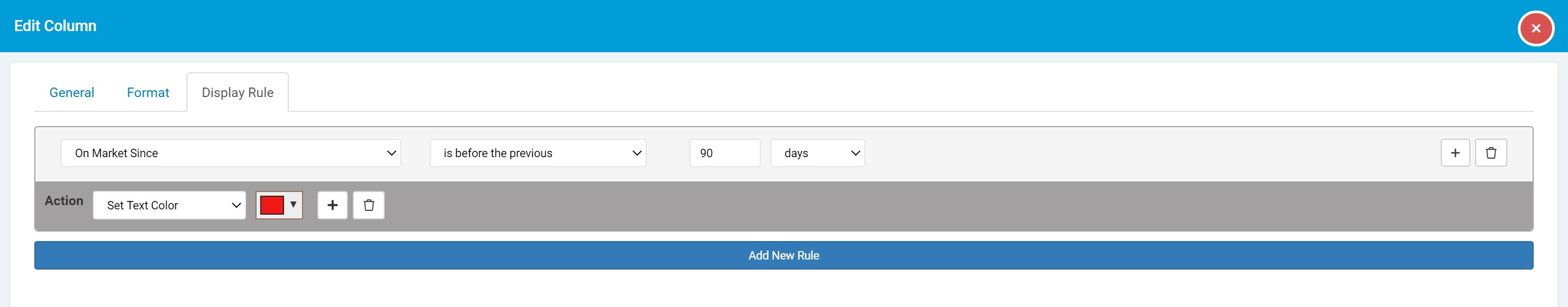
Within the Listings list component on the live app, the On Market Since field will display in red for any listings that have been on the market for more than ninety days.

As we discuss Display Rules extensively within its own article, please view the Display Rules article to learn how to create display rules for each field or link.
Please Note: When validating display rules against other fields, those fields must be present in the list component.
Customizing table components
While we have so far discussed how to customize fields and links within a list component, let's now discuss how to customize list components as a whole, including list-wide settings such as data source filtering, list filters, list layout settings, and advanced list options.
Within a list component, you can customize these list-wide settings within their respective tabs that can be found on the left-side menu of each list component.
Let's discuss each of these list-wide settings, beginning with the Data Source tab.
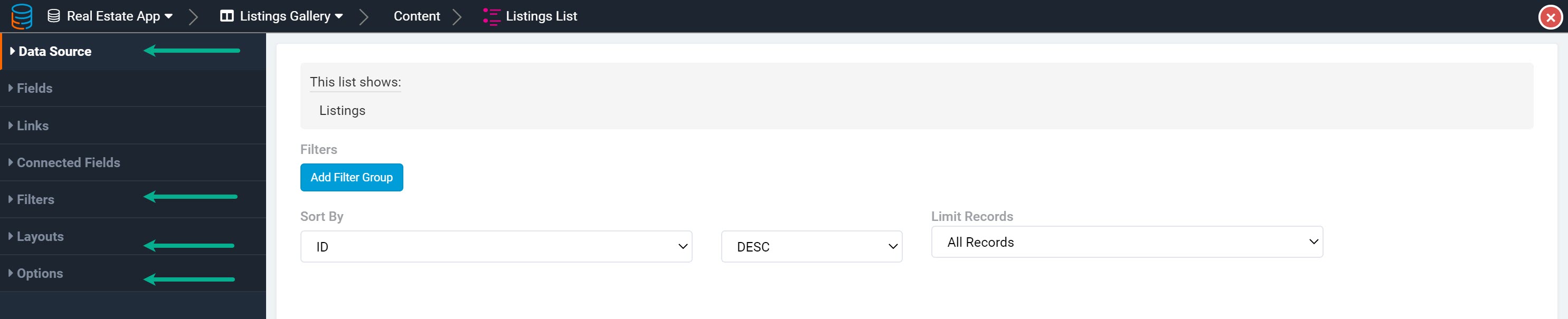
Data Source
The Data Source tab of each list component is where you can filter and sort which records should be displayed in this list component using "server-side" filtering.
Data source filtering
By default, all records from a list component's data table will be displayed within that list component. However, you can filter which records should be filtered through to be shown in the list by clicking the Add Filter Group button and adding a server-side filter.
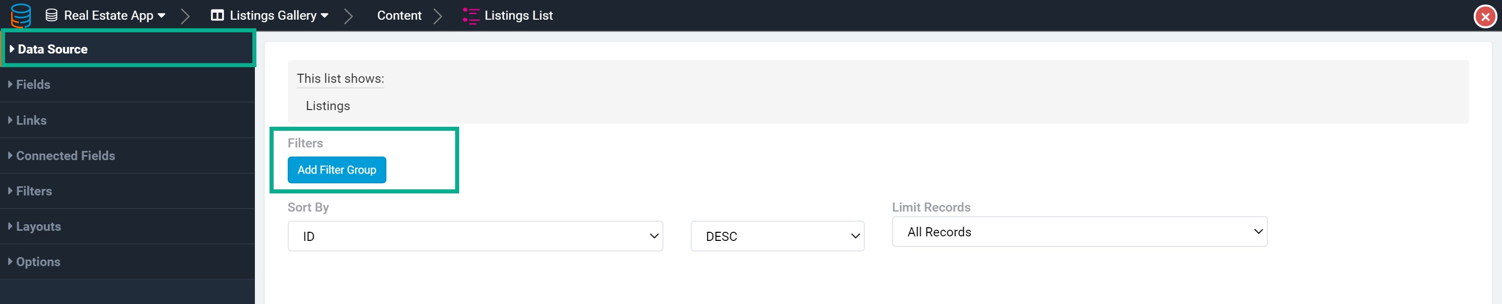
The Data Source tab is also where you can view the source of which data table is being used within this specific list component. For instance, as you can see in the Data Source tab of the Listings list component, this list component is displaying records from the Listings data table.

By default, all listing records within the Listings data table will be displayed within this Listings list component. However, if you wish to filter this list to exclude Sold listings, click on the Add Filter Group button and create a filter to only show listings with a status that is not sold.
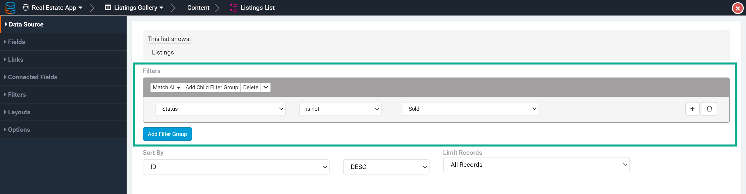
Now, Sold listings will be excluded from displaying within list Listings list component.

You can add multiple conditions within one filter group by clicking the +icon to the right of each existing condition. For instance, you can create a filter to only show listings with a status of For Sale and a listing price of under $2,000,000.
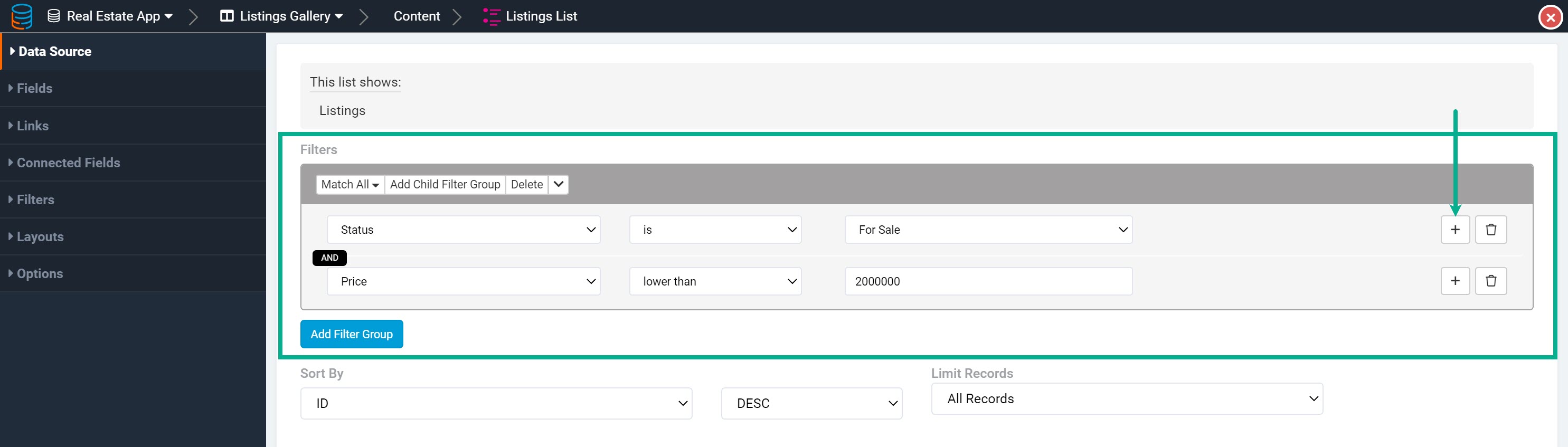
Now, only listings that are For Sale and asking under $2,000,000 will be filtered through and displayed in this Listings list.

You can create multiple filter groups by clicking on the Add Filter Group button beneath each existing filter group.
Data source sorting
Within the Data Source tab of each list component, you can also set a custom sorting method for the records that will be filtered through and displayed within the list.
For instance, within a Listings list component, you can create a custom sorting method to sort listing records by descending order of listing price.

Now, the listing records will be displayed in descending order of their listing price throughout the list component.

For a more comprehensive discussion of data source filtering, please view the Data Source article.
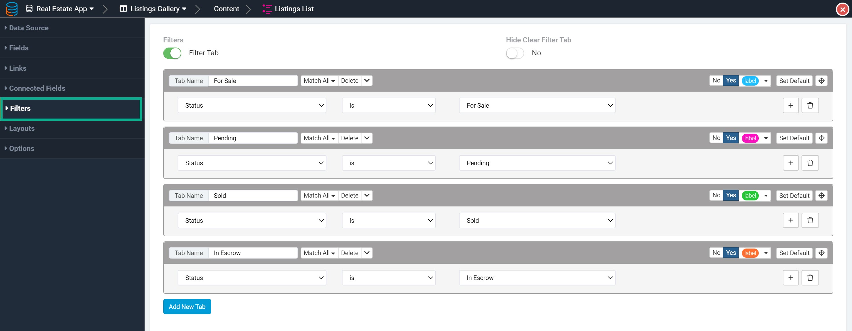
List Filters
The Filters tab of each list component is where you can create front-end filter tabs for users to filter, organize, and further customize your list components.
By default, the Filters setting is disabled for each list component as shown below.

To enable list filter tabs, enable the Filters setting and create your filter tabs by giving each tab a name, a condition, and an optional color tag. You can add additional filter tabs by clicking on the Add New Tab button beneath each existing tab.
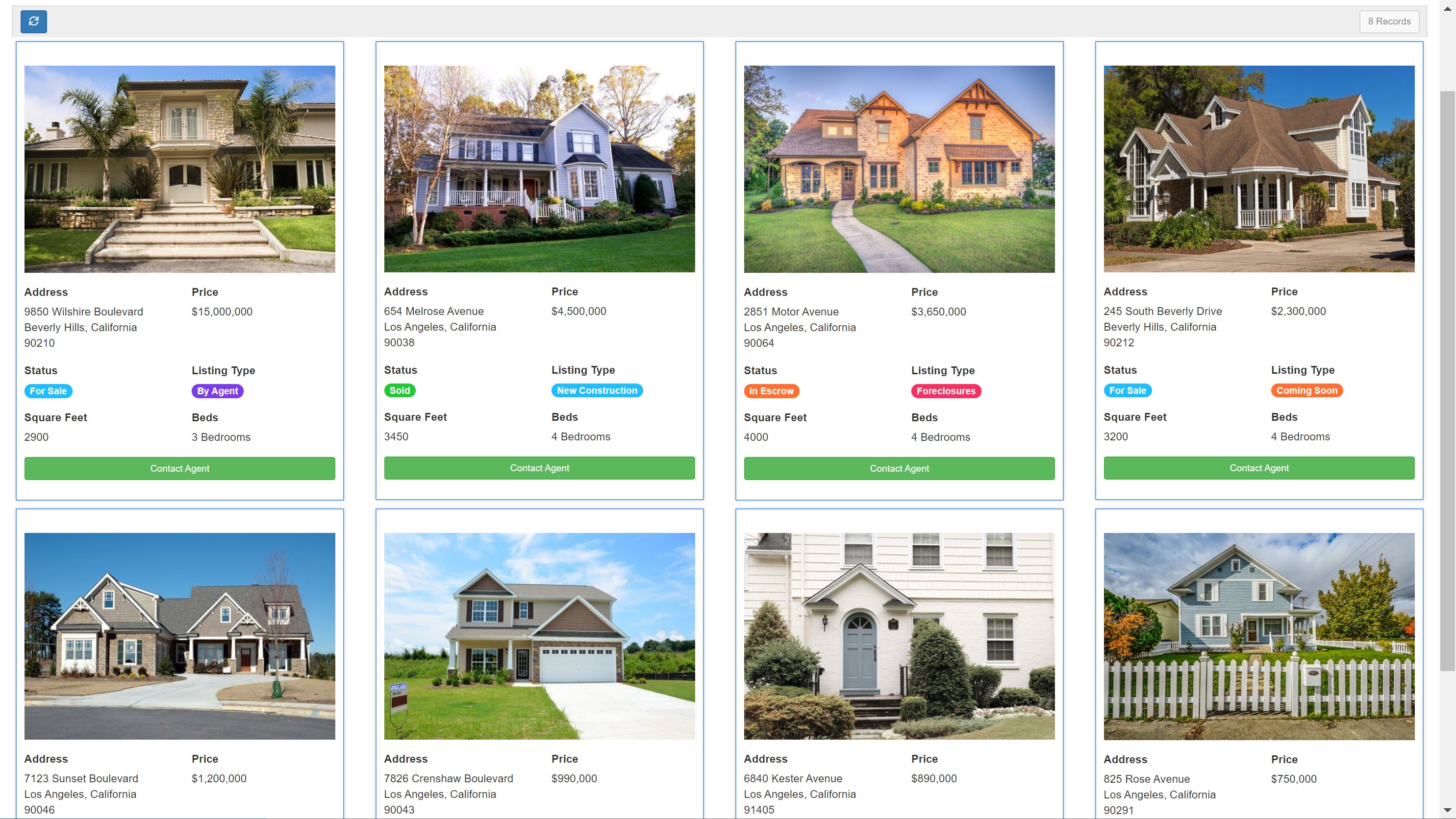
For instance, within a Listings list component you can create filter tabs for each listing Status as demonstrated below. Each filter tab has a tab title name of For Sale, Sold, Pending, and In Escrow and a condition to show only records of each listing status within each filter tab. Each filter tab is also assigned a color tag to color-code the filter tabs.
On the live app, the Listings list component will now display these front-end filter tabs for users to filter records by Status when a filter tab is selected.

As you can see in the above gif, clicking on the Clear Filter tab will clear all filters and once again display all records within the list component.
You can choose to hide this Clear Filter tab by toggling the Hide Clear Filter Tab setting from No (default) to Yes.
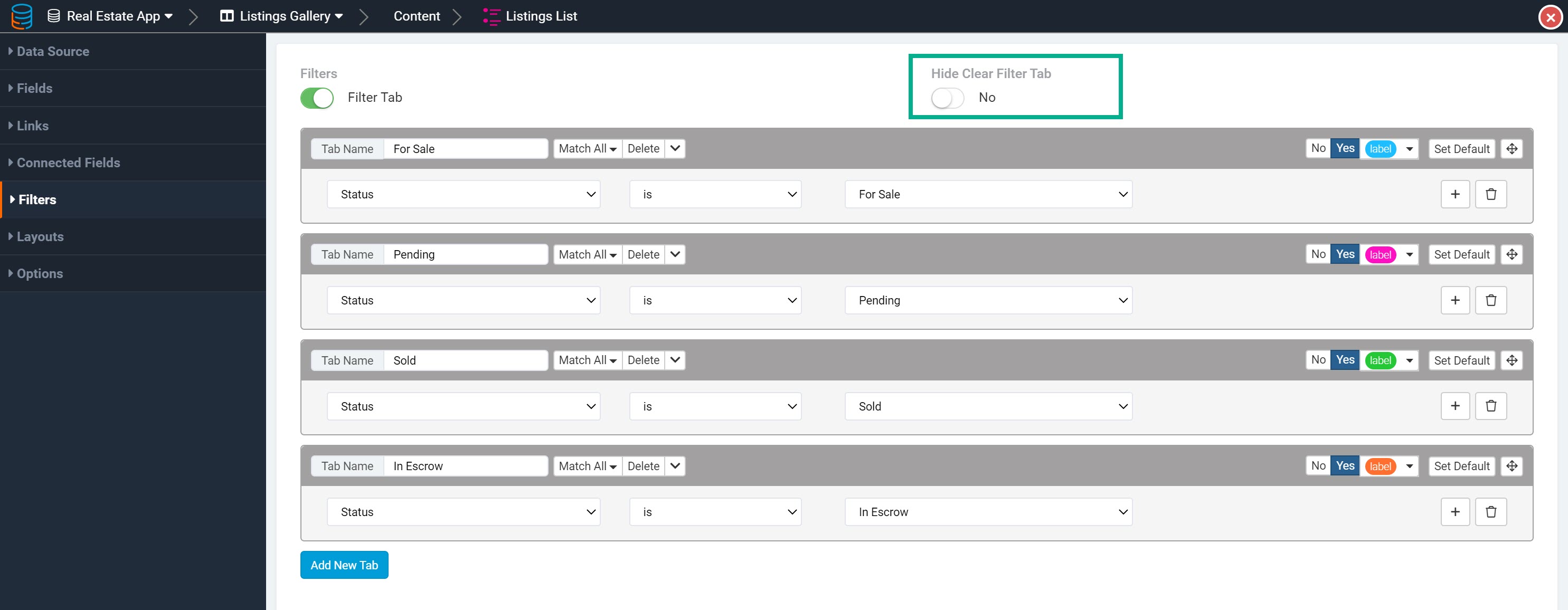
If you set the Hide Clear Filter Tab setting to Yes, the Clear Filter tab will no longer be available on the list component on the live app.

When the page first loads, none of the filter tabs will be chosen by default. To set a specific filter tab to be applied by default when the page loads, click on the Set Default button for that specific filter tab.

Layouts tab
The Layouts tab of each list component is where you can customize the List Layout as well as the border settings for each record column/card.
List Layout
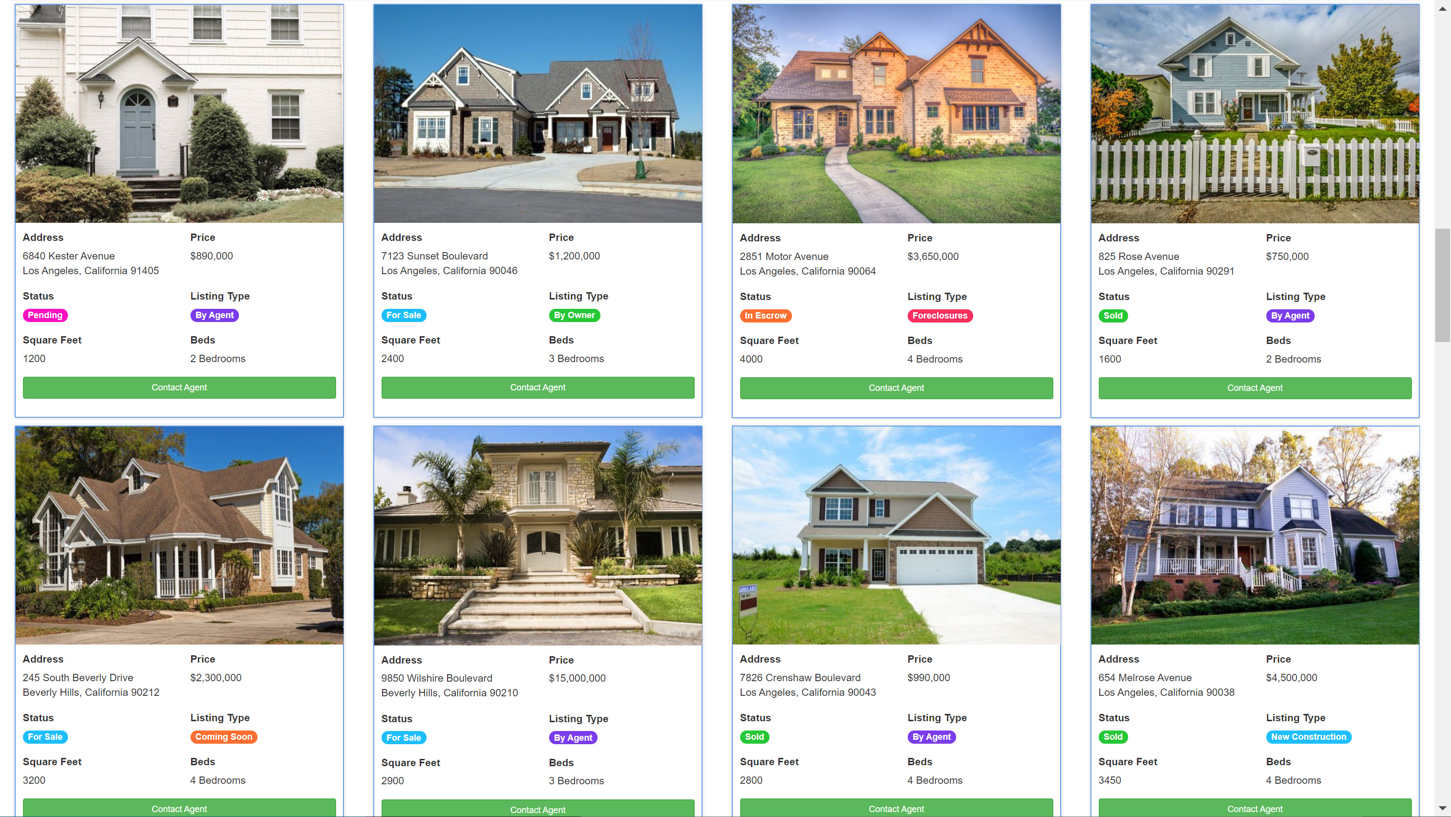
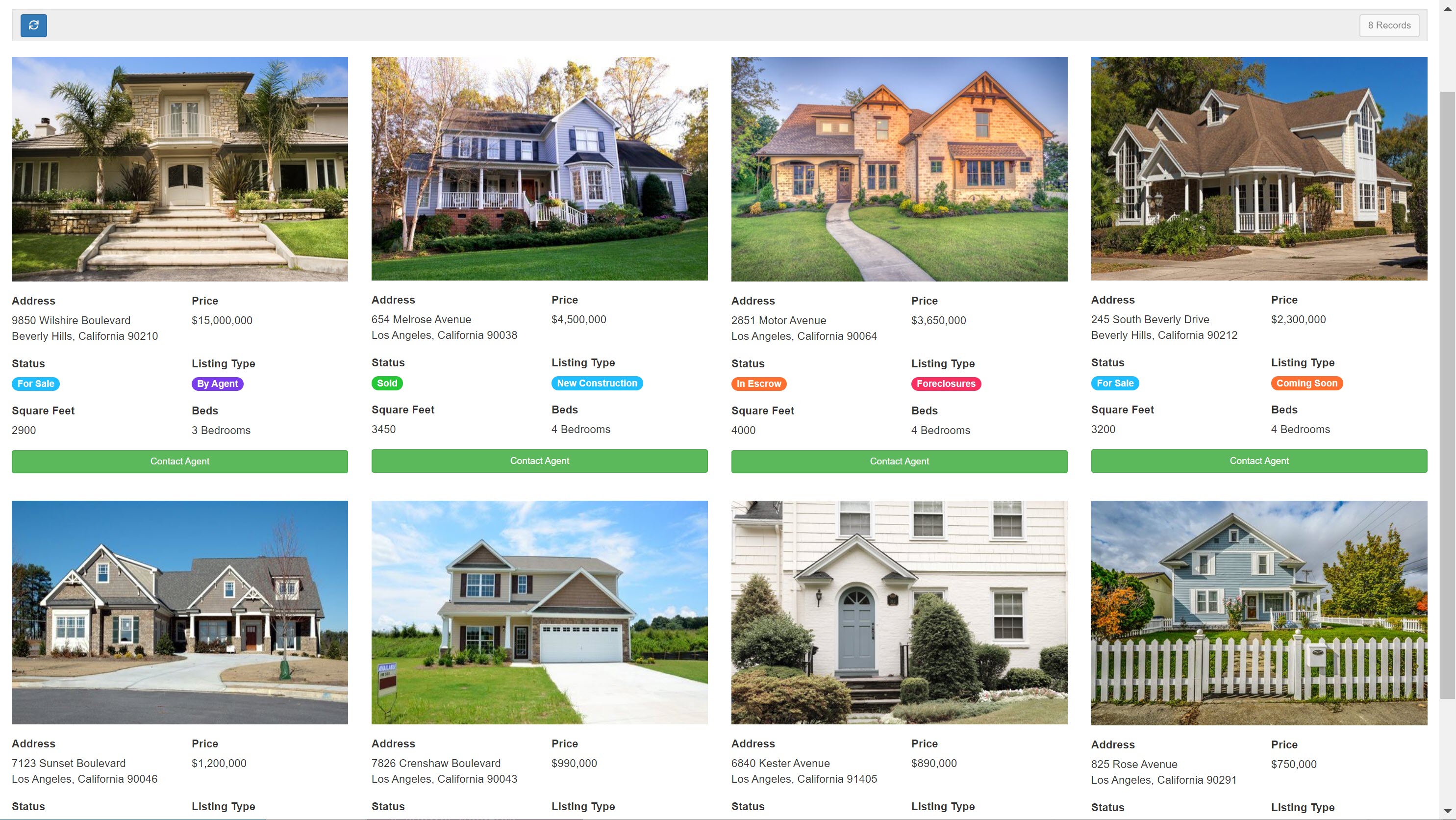
The List Layout is the record column/card configuration used to display records within the list component. By default, records in a list component are displayed in a three-record column/card configuration as shown below.
You can change the list layout from the default three-record column/card configuration to a different pre-defined record column/card configuration in the list component's Layouts tab > List Layout setting.
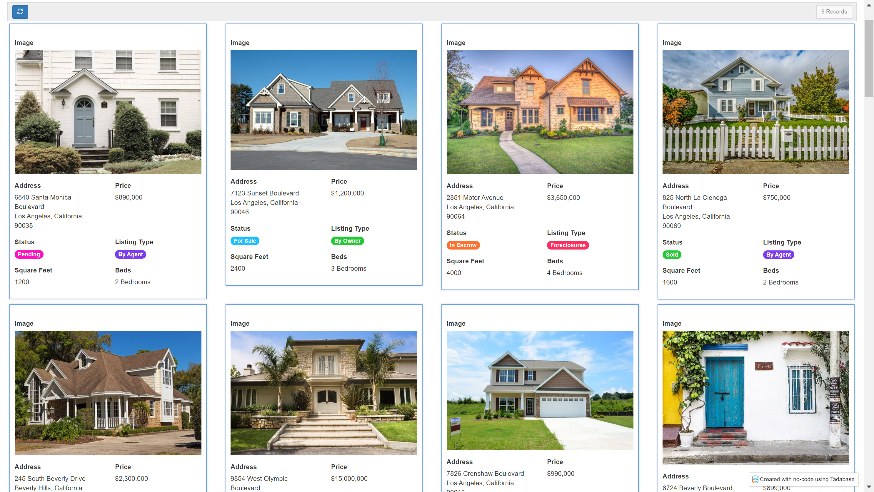
For instance, you can choose a list layout a four-record column/card configuration as shown below.
Please read the List Layouts section within this article to learn more about list layouts.
List borders
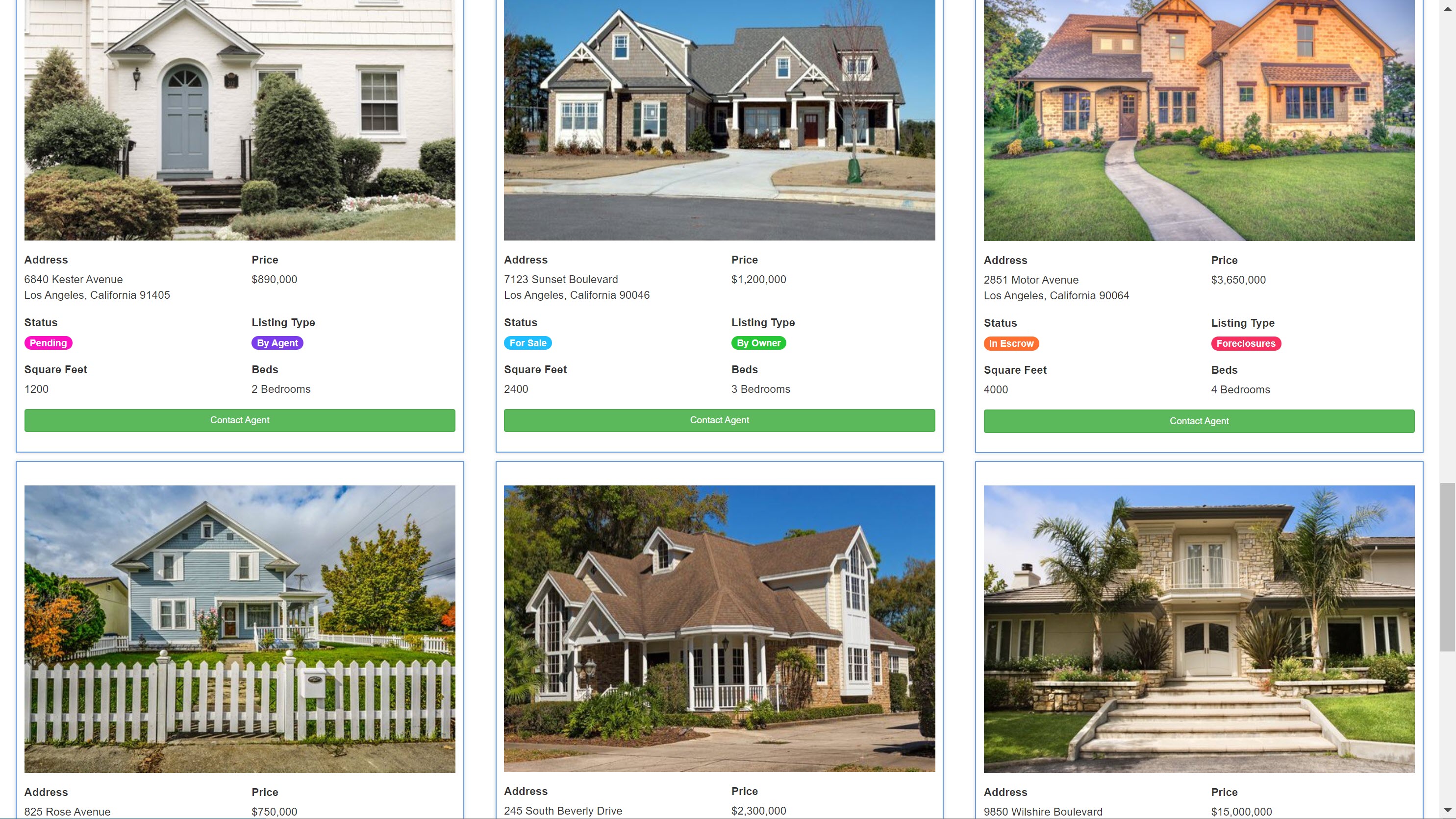
By default, records in a list component are displayed with a standard blue border box surrounding each record, as shown in the sample list component below.
As you can see in the list component's Layouts tab > Border Box settings, the default border surrounding each record in a list component includes a full border position around all sides of the records, a border width of 1 pixel, a border radius of 1 pixel, and a border color of blue.
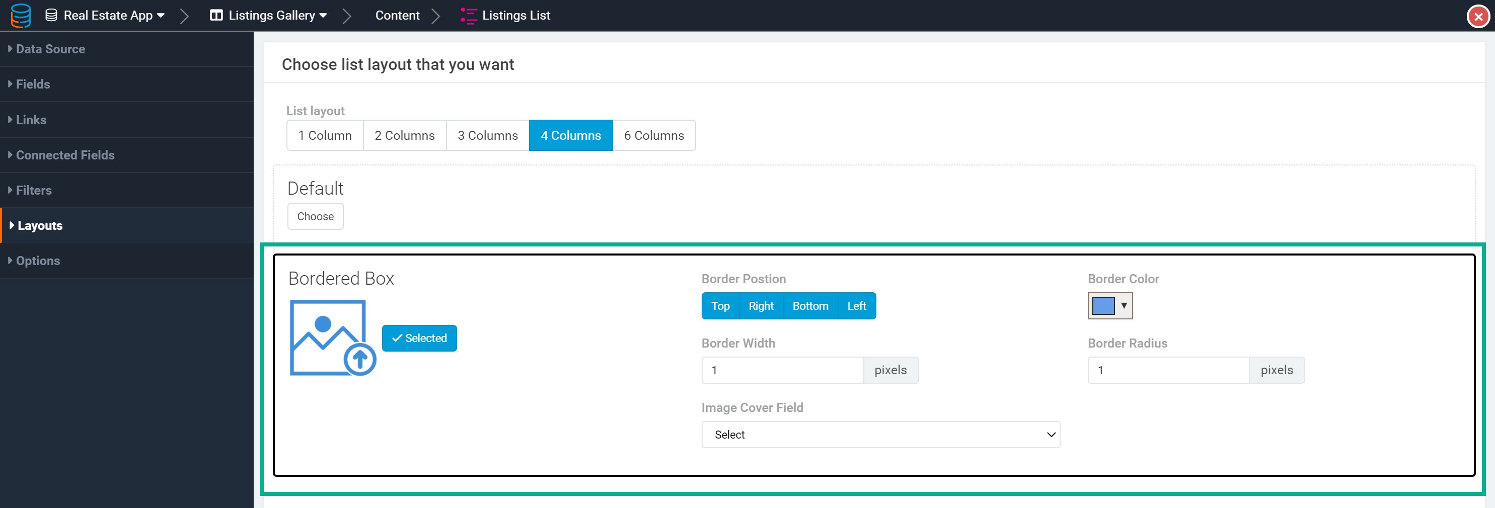
You can change these border settings by changing any aspect of the record border, including its color, position, width or radius.
For instance, you can change the Listings list component's borders to a border width of 5 and a border radius of 5.

Which will make the borders surrounding each record appear as such:

Alternatively, you can remove all borders from the list component by selecting the Default (No Borders) setting.

This will remove all borders from the list component.
To re-enable the list borders, simply click "Choose" next to the Borders setting.

Image cover field
Within the Layouts tab > Border settings > Image Cover Field setting, you can choose to set an image cover for each record using an image field.

When you set the Image Cover Field setting to an image field, the images within that image field will fill the top of each record, similar to a cover.

As you can see in the list component above, using an image cover field will fill the image values as a cover for each record, which results in a stunning gallery display for each record.
Please Note: When you use an image cover field you must remove the image field from the list component. Using an image cover field while also adding the image field within the list component will cause two images to display within the list component. Therefore, if you use an image cover field you must remove the image field from the list component.
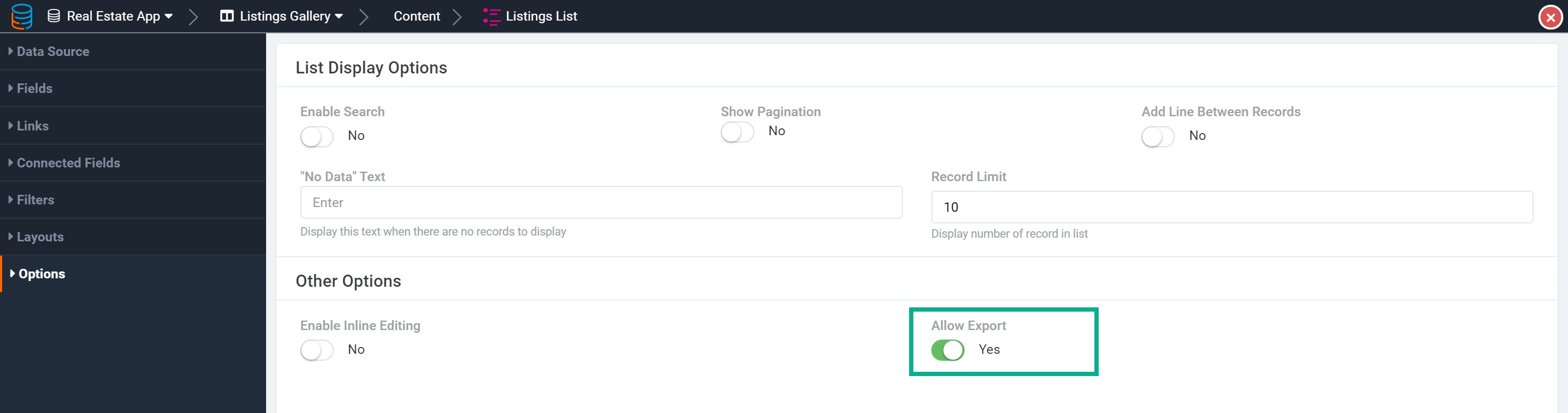
Advanced list options
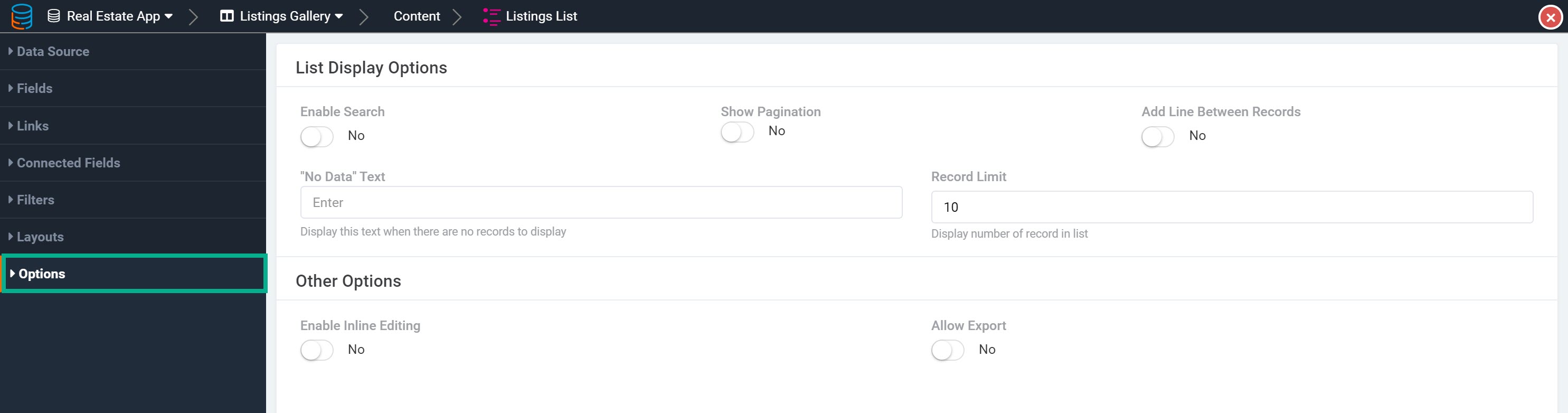
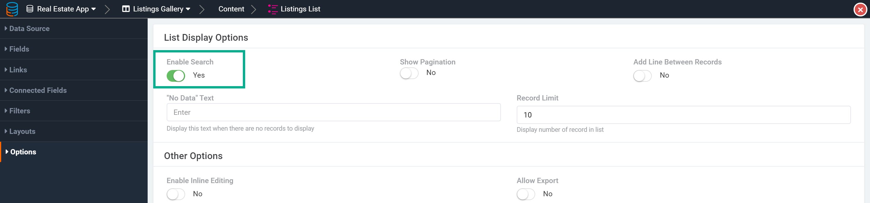
Enable search
Within the Options tab of a list component, you can enable the Enable Search setting which will allow users to search through records in the list via a search bar.

To enable the search bar, simply set the Enable Search setting to Yes.
Show pagination
Within the Options tab of a list component, you can enable the Show Pagination setting.

When set to Yes, the list's pagination will display at the top of the list component.

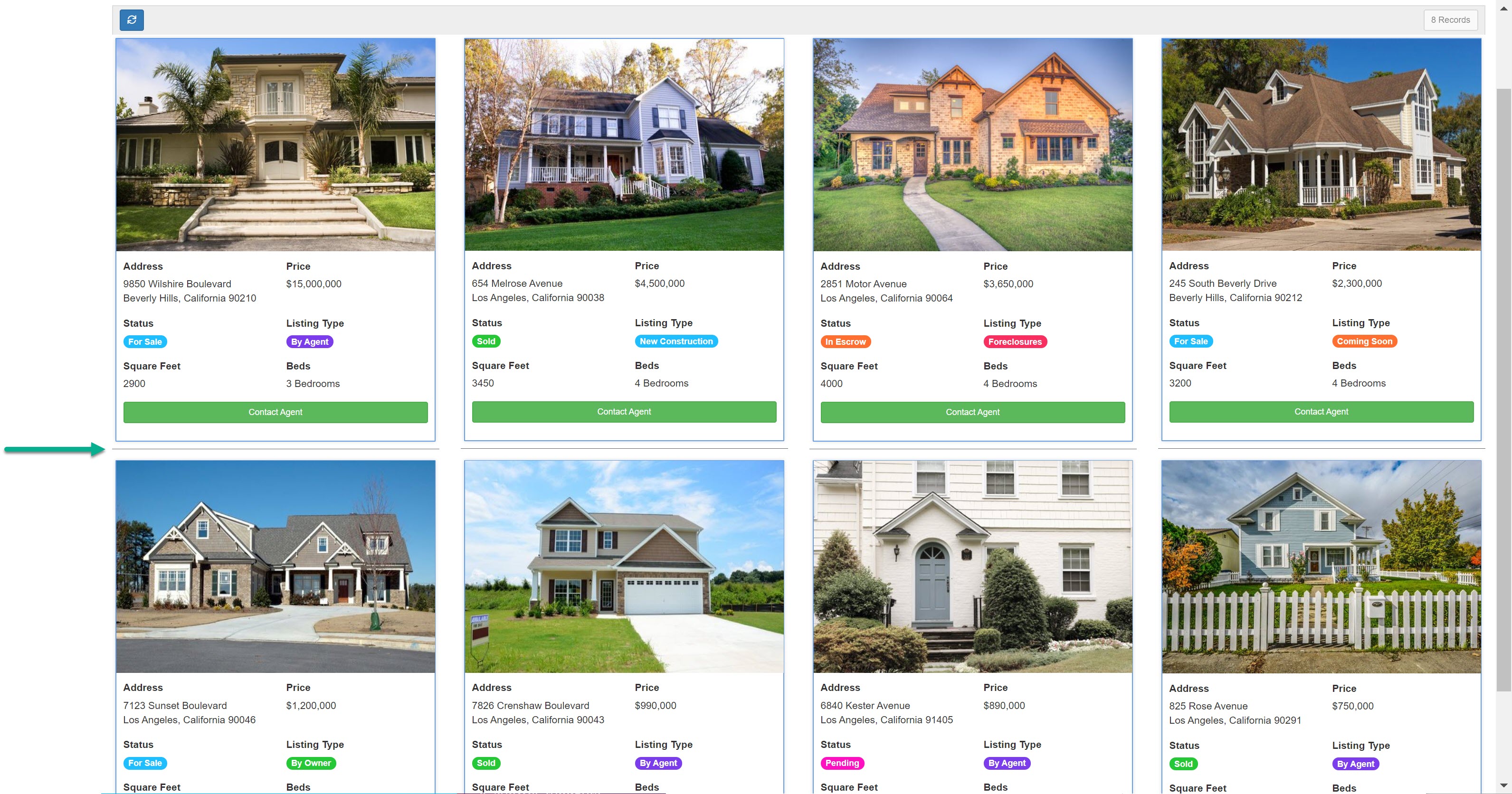
Add line between records
Within the Options tab of a list component, you can add a separating line between each line of records within a list component by setting the Add Line Between Records setting to Yes.
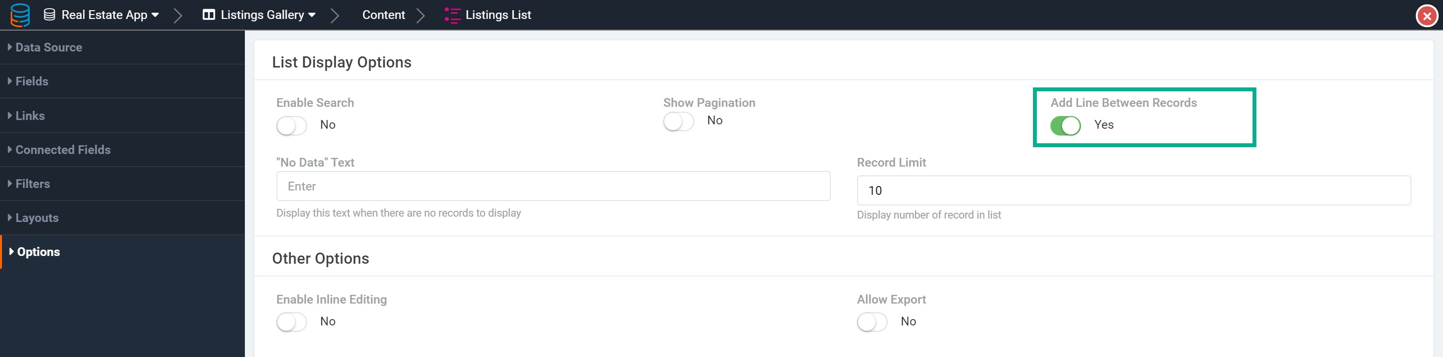
This will add a line in between each line of records within the list component.
No data text
Within the Options tab of a list component, you can enter the text you wish to display when a list component's data table contains no data.
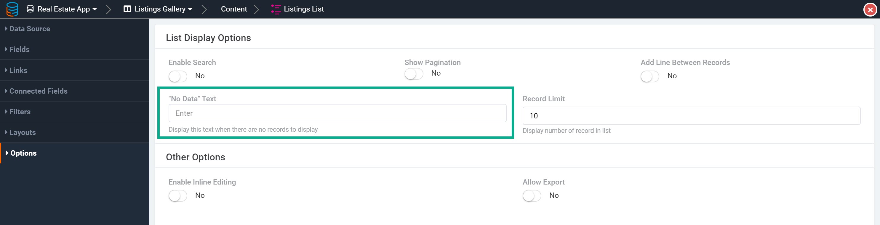
By default, when a data table contains no data, the list component will display with the text, "No record found".

You can choose to change this text within this setting.
Record limit
Within the Options tab of a list component, you can customize the Record Limit per page for each list component. By default, ten records are shown per page within a list component.

Enable inline editing
Within the Options tab of a list component, you can enable the Enable Inline Editing setting. When set to Yes, this setting will allow users to simply click on any value within the list component on the live app to edit that value inline and on the fly without having to use an Edit Form or edit the value from within the Data Builder.

As we discuss inline editing extensively within its own article, please view the Inline Editing article to learn more.
Allow export
Within the Options tab of a list component, you can enable the Allow Exports setting to allow the records within this list component to be exported.