
Add padding around a component
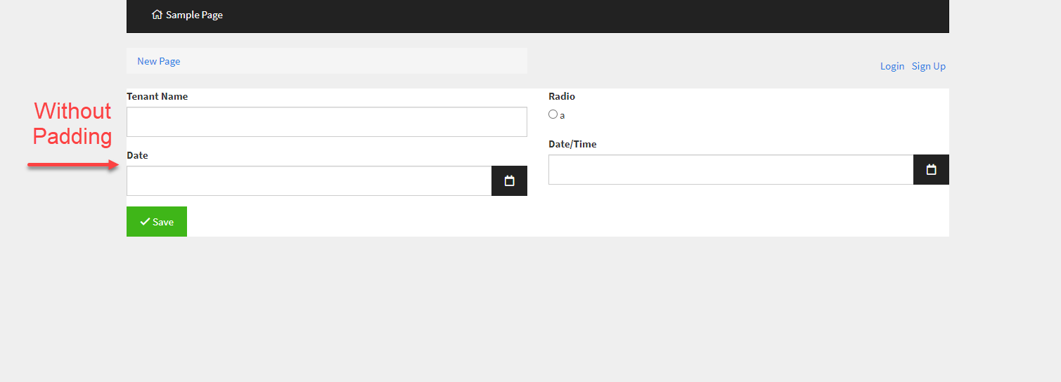
By default, no padding is added around components on your page, as illustrated in the image below.
To add custom padding to a component, hover over your selected component in the Page Builder, click the gear settings icon, and select the Design option:

Within the Spacing tab of the component's design window, add custom padding in pixels:

As you can see in the image below, the added padding will appear around the component on your live app.

Did this page help you?