
Embeddable Components

What is an Embeddable Component?
Embeddable components are an easy way to display read-only data from within your Tadabase app, inside websites hosted outside of Tadabase via a short user-generated script.
Use Cases
The primary benefit of the embeddable component is that it enables all your data to be managed in one place, since your data is already hosted within Tadabase.
For example, you can keep your marketing sites updated with the latest showcase data, such as:
- Real Estate Listings
- Pricing Tables
- Frequently Asked Questions
- Customer Testimonials
Embeddable Component Types
There are several component types currently available:
Creating an Embeddable Component
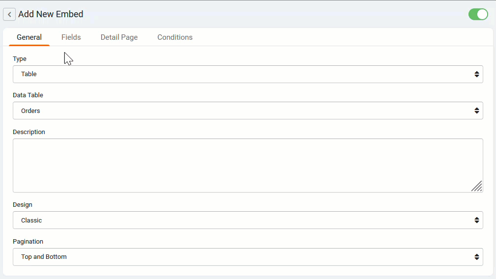
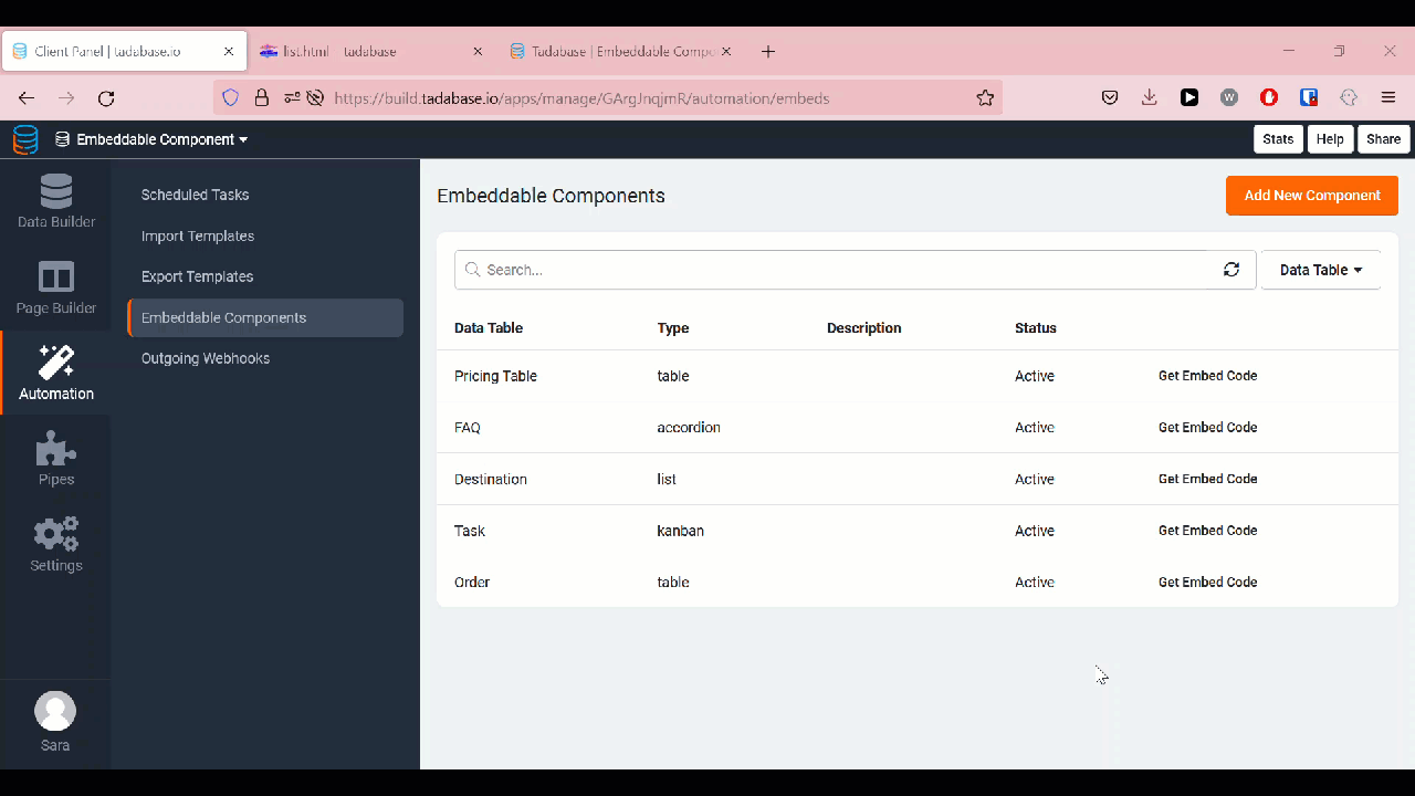
In the Tadabase builder, navigate to the automation pane. In the automation pane, choose "Embeddable Components". Click the "Add New Component" button to create a component and generate its embed code.

Table Component
The table component is a simple component useful for displaying excel-like data in a traditional table.
Example
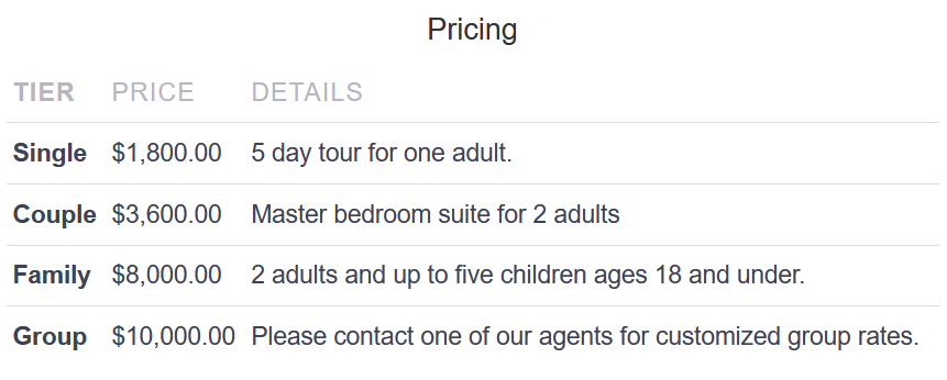
To add a table component, choose Table under Type and select the Data Table.
Please note: Like any Tadabase component, the Data Source cannot be changed after the component is saved.

Designs
The table component now has 3 design style options you can choose from: Classic, Elegant, and Modern. Choose the style that best matches your website's design.
|
Classic
|
Elegant
|
Modern
|


Pagination
On the bottom of the General Tab, there is a pagination drop-down list with four options: Top, Bottom, Top and Bottom, Hide, and Load More.

Top Pagination
Select this option to show pagination on the top of the embeddable component.

Top and Bottom Pagination
Select this option to show pagination on the top and bottom of the embeddable component.

Load More Pagination
Select this option to show a "Load More" button at the bottom of the component. Clicking this button will load an additional page of records until there are no more records to load.

Hide Pagination
Pagination is not shown.

Add Fields
Next, select the fields to include in your embeddable component. Navigate to the fields tab, and select "Add All Fields" to add all the data table's fields to your component. To add a single field, click "Add New Field".
Note: Easily drag and drop the fields to switch the order of the columns.

Customizing Columns
In the fields tab, columns can be easily customized by adjusting the title, width, alignment, CSS class, or adding Custom CSS.

Column Title
Add a title to appear on the top of a field column. To hide the column title, leave this field blank.

Column Width
Enter a custom column width, along with the width measurement (i.e., "50px" for pixels, "2in" for inches). If this field is left blank, the column width will be set to default.

Alignment
Select the desired text alignment for each column. The alignment options are: left, center, right, and justify.

CSS Class
Add custom CSS Classes to a specific column.

Custom CSS
Add custom CSS to be applied to a specific column. CSS must be entered in the proper syntax.

Record Details
In the "Detail Page" tab, enable the record details popup. Once enabled, enter a title and select which fields to include in the details popup. If desired, add custom CSS classes and Custom CSS to each field, in the Class and Custom fields respectively.

Filters and Sorting
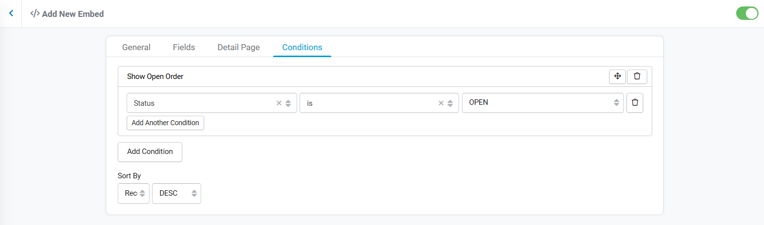
Conditions
Sort By
The "Sort By" option allows your records to be sorted by a specified field. By default, the records are sorted by the record ID.
In the Conditions tab, set the sort field and select whether to sort the records in ASC (ascending) or DESC (descending) order.

Embedding
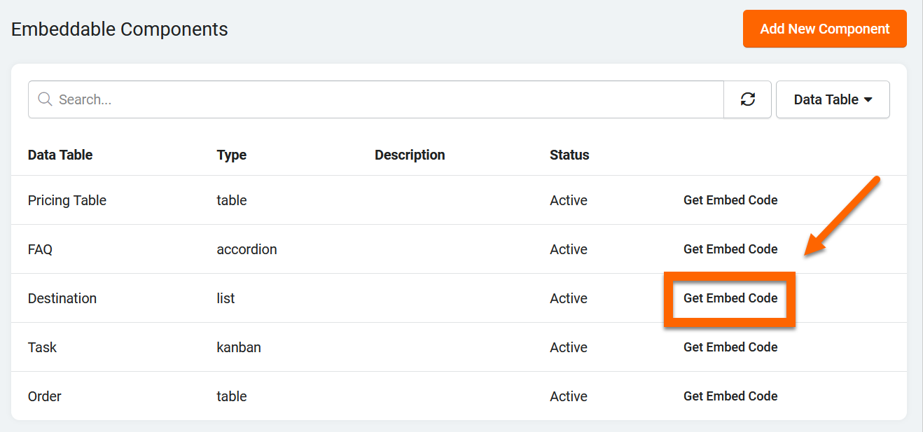
Once you saved your component, it will appear in your list of embeddable components. Simply click "Get Embed Code" to copy the generated script to your clipboard.

Next, paste the script into the source code for your web page.

List Component
The List Component showcases your data in a gallery view and is often used for data with image fields, such as real-estate listings and profile cards.
Example

To add a list component, choose List under Type and select the Data Table. To add a cover photo, as seen in the image above, select an image, file, or attachment field from the Card Cover Field drop-down list.
For the cover photo to work correctly, the attachment field settings in the data builder must have the "secured" option set to "off". If the field is set to "secured", the images cannot be accessed outside of the Tadabase app.

Designs
The list component now has 3 design style options you can choose from: Classic, Elegant, and Modern. Choose the style that best matches your website's design.
|
Classic List Style
|
Elegant List Style
|
Modern List Style
|


Pagination
On the bottom of the General Tab, there is a pagination drop-down list with four options: Top, Bottom, Top and Bottom, Hide, and Load More.

Top Pagination
Select this option to show pagination above the embeddable component.

Bottom Pagination
Select this option to show pagination below the embeddable component.

Top and Bottom Pagination
Select this option to show pagination on above and below the embeddable component.
Load More Pagination
Select this option to show a "Load More" button at the bottom of the component. Clicking this button will load an additional page of records until there are no more records to load.

Hide Pagination
If the "Hide" option is selected, pagination will not be shown.
Add Fields
Next, select the fields to include in your embeddable component. Navigate to the fields tab, and select "Add All Fields" to add all the data table's fields to your component. To add a single field, click "Add New Field".
Note: Easily drag and drop the fields to switch the order of the columns.
Customizing Columns
In the fields tab, columns can be easily customized by adjusting the title, width, alignment, CSS class, or adding Custom CSS.
Column Title
Add a title to appear on the top of a field column. To hide the column title, leave this field blank.

Column Width
Enter a custom column width, along with the width measurement (i.e., "50px" for pixels, "2in" for inches). If this field is left blank, the column width will be set to default.

Column Text Alignment
Select the desired text alignment for each column. The alignment options are: left, center, right, and justify.

CSS Class
Add custom CSS Classes to a specific column.

Custom CSS
Add custom CSS to be applied to a specific column. CSS must be entered in the proper syntax.
Record Details
In the "Detail Page" tab enable the record details popup. Once enabled, enter a title and select which fields to include in the details popup. If desired, add custom CSS classes and Custom CSS to each field, in the Class and Custom fields respectively.
For the Popup Title, you enter either text, a Field Name in brackets, or a combination of both. See example below.

This will result in a popup title that looks like this:

Filters and Sorting
Conditions
Sort By
The "Sort By" option allows your records to be sorted by a specified field. By default, the records are sorted by the record ID.
In the Conditions tab, set the sort field and select whether to sort the records in ASC (ascending) or DESC (descending) order.
Embedding
Once you saved your component, it will appear in your list of embeddable components. Simply click "Get Embed Code" to copy the generated script to your clipboard.
Next, paste the script into the source code for your web page.
Kanban Component
The Kanban Component displays your data in swim lanes, and is designed to help visualize work, limit work-in-progress, and maximize efficiency. The Kanban Component is most commonly used for data relating to project management.
Kanban can only be used when there is a radio field which will be utilized for tracking each of the lanes. For example, if you have a radio field called "Status" with several options like: "Open" "Pending" "Completed" each of these can be a lane on the kanban board.
Example

To add a Kanban component, choose Kanban under Type and select the Data Table. Then, you must select a radio field to be the Kanban Field. To add a cover photo, as seen in the image above, select any image, file, or attachment field from the Card Cover Field drop-down list.
For the cover photo to work correctly, the attachment field settings in the data builder must have the "secured" option set to "off". If the field is set to "secured", the images cannot be accessed outside of the Tadabase app.
Please note: The Data Table cannot be changed after the component is saved.

Designs
The Kanban component now has 3 design style options you can choose from: Classic, Elegant, and Modern. Choose the style that best matches your website's design.
|
Classic Kanban Style
|
Elegant Kanban Style
|
Modern Kanban Style
|


Pagination
Pagination cannot be applied to the Kanban component.
Add Fields
Next, select the fields to include in your embeddable component. Navigate to the fields tab, and select "Add All Fields" to add all the data table's fields to your component. To add a single field, click "Add New Field".
Note: Easily drag and drop the fields to switch the order of the columns.
Customizing Columns
In the fields tab, columns can be easily customized by adjusting the title, width, alignment, CSS class, or adding Custom CSS.
Column Title
Add a title to appear on the top of a field column. To hide the column title, leave this field blank.
Column Width
Enter a custom column width, along with the width measurement (i.e., "50px" for pixels, "2in" for inches). If this field is left blank, the column width will be set to default.
Alignment
Select the desired text alignment for each column. The alignment options are: left, center, right, and justify.
CSS Class
Add custom CSS Classes to a specific column.
Custom CSS
Add custom CSS to be applied to a specific column. CSS must be entered in the proper syntax.
Detail Page
In the "Detail Page" tab enable the record details popup. Once enabled, enter a title and select which fields to include in the details popup. If desired, add custom CSS classes and Custom CSS to each field, in the Class and Custom fields respectively.
For the Popup Title, you enter either text, a Field Name in brackets, or a combination of both. See example below.

This will result in a popup title that looks like this:

Filters and Sorting
Conditions

Sort By
The "Sort By" option allows your records to be sorted by a specified field. By default, the records are sorted by the record ID.
In the Conditions tab, set the sort field and select whether to sort the records in ASC (ascending) or DESC (descending) order.
Embedding
Once you saved your component, it will appear in your list of embeddable components. Simply click "Get Embed Code" to copy the generated script to your clipboard.

Next, paste the script into the source code for your web page.

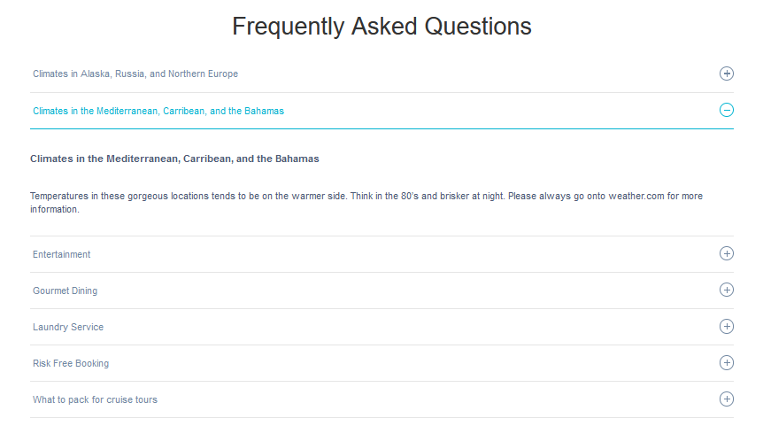
Accordion Component
The accordion component enables you to expand and collapse data when the title of the record is clicked. Common use cases for the Accordion Component include FAQs, product information, and any data which has a title and description.
Example

To add an accordion component, choose accordion under Type and select the Data Table. Then, you must select a field to be the Title Field.
Please note: The Data Table cannot be changed after the component is saved.

Designs
The accordion component now has 3 design style options you can choose from: Classic, Elegant, and Modern. Choose the style that best matches your website's design.
|
Classic Accordion Style
|
Elegant Accordion Style
|
Modern Accordion Style
|


Pagination
Pagination cannot be applied to the accordion embeddable component type.
Add Fields
Next, select the fields you wish to include in the embeddable component. Navigate to the fields tab, and select "Add All Fields" to add all the data table's fields to your component. To add a single field, click "Add New Field".
Note: Easily drag and drop the fields to switch the order of the columns.
Customizing Columns
In the fields tab, columns can be easily customized by adjusting the title, width, alignment, CSS class, or adding Custom CSS.
Column Title
Add a title to appear on the top of a field column. To hide the column title, leave this field blank.
Column Width
Enter a custom column width, along with the width measurement (i.e., "50px" for pixels, "2in" for inches). If this field is left blank, the column width will be set to default.
Alignment
Select the desired text alignment for each column. The alignment options are: left, center, right, and justify.
CSS Class
Add custom CSS Classes to a specific column.
Custom CSS
Add custom CSS to be applied to a specific column. CSS must be entered in the proper syntax.
Filters and Sorting
Conditions
The conditions feature allows you to display only the records that meet a specified condition.
Sort By
The "Sort By" option allows your records to be sorted by a specified field. By default, the records are sorted by the record ID.
In the Conditions tab, set the sort field and select whether to sort the records in ASC (ascending) or DESC (descending) order.

Embedding
Once you saved your component, it will appear in your list of embeddable components. Simply click "Get Embed Code" to copy the generated script to your clipboard.

Next, paste the script into the source code for your web page.

Important Details
- Embeddable components cannot be added to a Tadabase app, this feature is intended for external websites only.
- Currently, only one component can be embedded in a single web page.
- You can easily switch between different component types without losing any of your settings! For example, you can switch your component from a list to a table without losing the Card Cover Image settings.
Coming up...
- Timeline
- Calendar
- Get link to share
- Forms
- Secured components requiring logins
- Whole apps